Get Started
Install UI Kit 4.0.0 in a SPECS project, explore its System 3.0 example, and update the package to build spatial interfaces from ready-made components.
- Snapchat: not supported
- SPECS: fully supported
- Camera Kit Web: not supported
- Camera Kit Mobile: not supported
- SnapchatNot supported
- SPECSFully supported
- Camera Kit WebNot supported
- Camera Kit MobileNot supported
UI Kit (formerly Spectacles UI Kit) is a Lens Studio package of components, utilities, and assets for building interactive spatial user interfaces for SPECS: buttons, sliders, switches, text fields, scrolling windows, and panels. It gives your Lens the same design language as the rest of the system, and it works with Interaction Kit, the package that handles input. It is approachable for beginners and extensible for advanced users.
This page describes UI Kit 4.0.0, whose package is UIKit. UI Kit 4.0.0 needs Lens Studio 5.25 or
later and depends on three other 4.0.0 packages: Interaction Kit (InteractionKit), Icons, and
Motion. Its components use the System 3.0 theme.
- Designers: Use the Snap OS Design Kit (Figma) and Design for SPECS to create UI mockups with official tokens, styles, and components.
- Developers: Use UI Kit (this package) to implement those designs in Lens Studio.
Both resources share the same design language, so a design carries over consistently into development.
UI Kit updates frequently. For the changes in each version, see the UI Kit Release Notes.
Add UI Kit to a SPECS project
UI Kit components run in a SPECS project that has Interaction Kit set up in its scene. If you don't have a SPECS project yet, create one by following Set Up Lens Studio for SPECS. To add Interaction Kit to an existing project, see the Interaction Kit Get Started page.
Install the UI Kit package
-
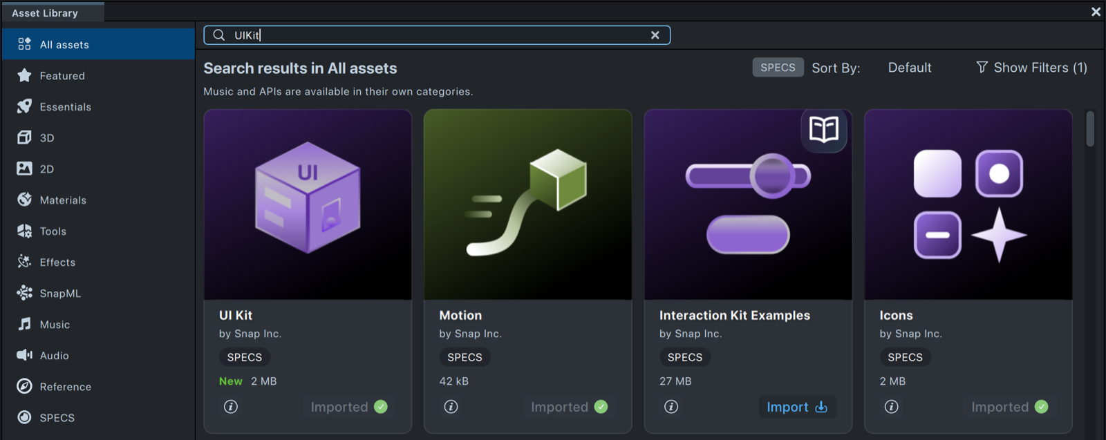
In Lens Studio, open Window > Asset Library.
-
In the search bar, type
UIKit. -
Select Import on the UI Kit card. The card then shows Imported.
-
In the Asset Browser, expand Packages and check that UIKit, InteractionKit, Icons, and Motion are all listed. UI Kit 4.0.0 needs all three of its dependencies at version 4.0.0; install any that is missing from the Asset Library the same way.
Explore the System 3.0 example
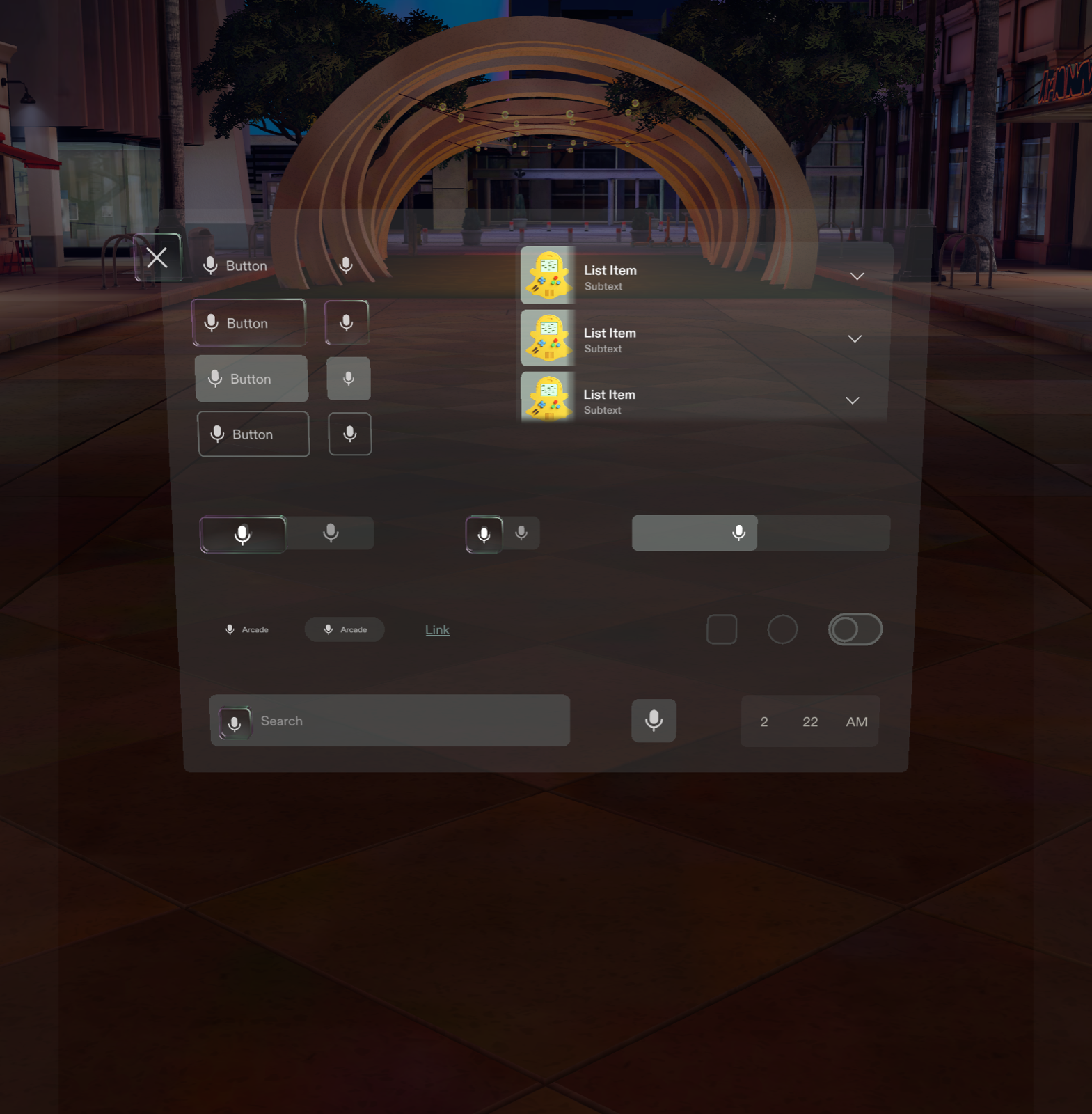
UI Kit includes an example prefab that shows its components in the System 3.0 theme:
-
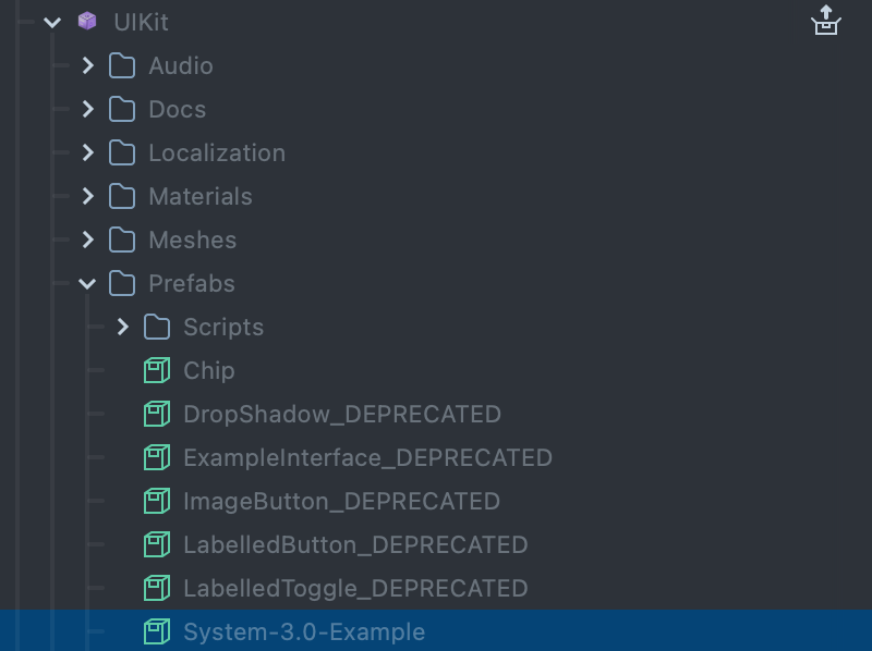
In the Asset Browser, expand Packages > UIKit > Prefabs.
-
Drag the System-3.0-Example prefab into the Scene Hierarchy.
-
Open the Preview panel to see the UI components in action and try how they respond to input.
The package also ships ExampleInterface_DEPRECATED, the example from earlier versions. It is
built on deprecated components; start from System-3.0-Example instead.
Next steps for UI Kit
- Read the component pages in this section, starting with Button and Frame, for each component's Inspector properties and a code example.
- Learn how to create a custom visual and extend a component.
Update UI Kit in a project
-
Open your project and wait for TypeScript compilation to finish.
-
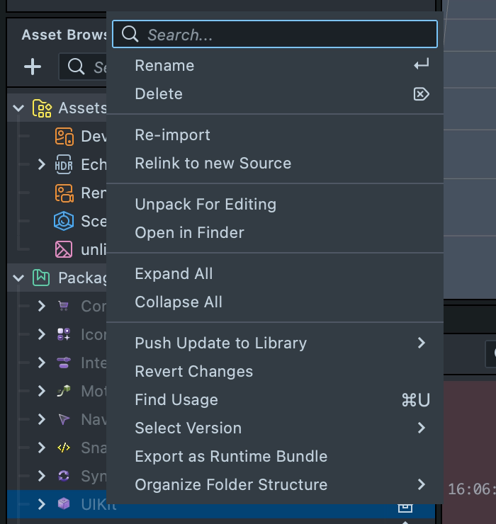
In the Asset Browser, right-click the UIKit package.
-
When a newer version is in the Asset Library, the menu offers Pull Update from Library: select it. To install a specific version, open Select Version and choose the version.
Now your project is updated.
To check for updates manually, search the Asset Library for UIKit and see whether a newer
version is available.
An update can cause compilation errors when the API changed. Read the
Release Notes for the new APIs and edit your scripts to match. In UI Kit
4.0.0, for example, scripts import from UIKit.lspkg/Scripts/... (the package was renamed), the
single Button component replaces RectangleButton, CapsuleButton, and RoundButton, and
System 3.0 is the only theme: projects set to System 2.0 get System 3.0 and a one-time warning.