Backplate
The UI Kit BackPlate component is deprecated in UI Kit 4.0.0: back SPECS UI content with a Frame or a RoundedRectangle instead. Reference for existing BackPlates.
- Snapchat: not supported
- SPECS: fully supported
- Camera Kit Web: not supported
- Camera Kit Mobile: not supported
- SnapchatNot supported
- SPECSFully supported
- Camera Kit WebNot supported
- Camera Kit MobileNot supported
A backing surface helps situate content in AR space: if you have some text, an alert, or a dialog,
but you don't want it to float without any context, put a surface behind it. In earlier UI Kit
versions that surface was the BackPlate component. In UI Kit 4.0.0, BackPlate is deprecated and
has two replacements:
- Frame for panels: a backing with built-in moving, scaling, billboarding, and close and follow buttons.
RoundedRectanglefor lightweight custom surfaces: a plain rounded rectangle with a color, gradient, or texture fill and an optional border, and no interaction of its own.
BackPlate still works in UI Kit 4.0.0, so existing projects keep running; use a Frame or a
RoundedRectangle in new work. The BackPlate reference
at the end of this page covers BackPlates in existing projects.
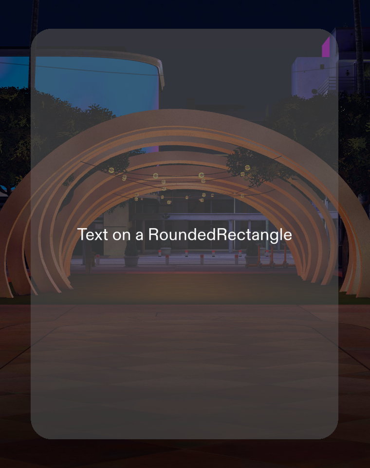
Back UI content with a RoundedRectangle
A RoundedRectangle is the lightweight replacement for a BackPlate. Its main Inspector
properties are:
| Property | Description |
|---|---|
| Render Order | Sets the renderOrder of the surface. |
| Size | The width (X) and height (Y) of the surface in local space centimeters. The default is 10 × 10. |
| Corner Radius | The radius of the corners in local space centimeters. The default is 1. |
| Opacity | The surface's opacity. The default is 1. |
| Gradient | Fills the surface with a gradient instead of a solid color. |
| Background Color | (shows if Gradient is off) The solid color of the surface. |
| Use Texture | (shows if Gradient is off) Fills the surface with a texture. |
| Border | Adds an inset border, with its own Border Size, Border Type (Color or Gradient), and Border Color. |
The script below creates a RoundedRectangle and sets its size, corner radius, and color. A
RoundedRectangle keeps the size, corner radius, and color you set before it initializes and
applies them when it builds its mesh, so you don't need to call initialize() yourself.
- TypeScript
- JavaScript
import { RoundedRectangle } from 'UIKit.lspkg/Scripts/Visuals/RoundedRectangle/RoundedRectangle';

/**
 * Example script for the RoundedRectangle component.
 * It creates a rounded rectangle surface and sets its size, corner radius and color.
 */

@component
export class ExampleRoundedRectangleScript extends BaseScriptComponent {
  onAwake() {
    const surface = this.sceneObject.createComponent(
      RoundedRectangle.getTypeName()
    ) as RoundedRectangle;
    surface.size = new vec2(15, 20);
    surface.cornerRadius = 1;
    surface.backgroundColor = new vec4(0.13, 0.13, 0.13, 1);
  }
}
// Import required modules
const RoundedRectangle =
  require('UIKit.lspkg/Scripts/Visuals/RoundedRectangle/RoundedRectangle').RoundedRectangle;

/**
 * Example script for the RoundedRectangle component.
 * It creates a rounded rectangle surface and sets its size, corner radius and color.
 */

function onAwake() {
  const surface = script.sceneObject.createComponent(
    RoundedRectangle.getTypeName()
  );
  surface.size = new vec2(15, 20);
  surface.cornerRadius = 1;
  surface.backgroundColor = new vec4(0.13, 0.13, 0.13, 1);
}

// Start the script
onAwake();
Back a UI panel with a Frame
When the content is a panel that people move, resize, or close, use a Frame instead of a BackPlate. A Frame also creates an Interaction Kit Interaction Plane around its content, as a BackPlate did. Its properties and a code example are on the Frame page.
BackPlate Inspector properties for existing projects
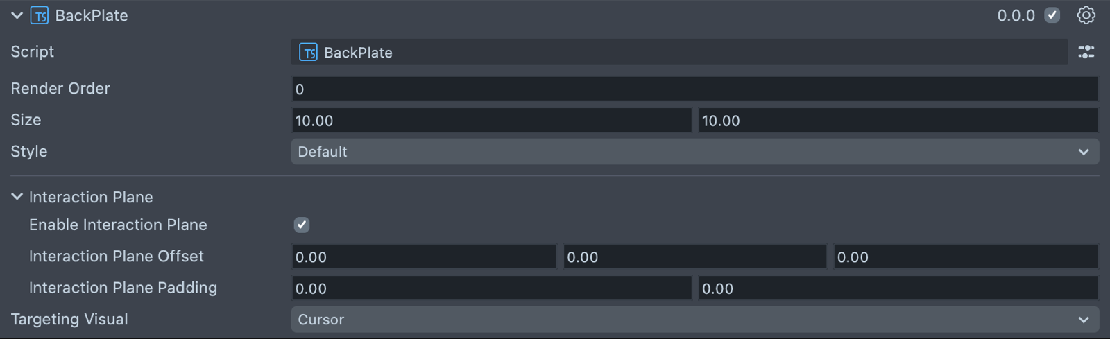
| Property | Description |
|---|---|
| Render Order | Sets the renderOrder for the visuals of the element. |
| Size | Sets the size of the element. X is width, and Y is height. The default is 10 × 10. |
| Style | The look of the plate: Default, Dark, or Simple. |
| Enable Interaction Plane | Turns on an Interaction Kit InteractionPlane for the element (on by default). An InteractionPlane defines a zone which triggers near field targeting logic for hand interactors; see Interaction System. |
| Interaction Plane Offset | (shows if Enable Interaction Plane is checked) A translation offset for the interaction plane trigger volume. |
| Interaction Plane Padding | (shows if Enable Interaction Plane is checked) A padding to extend the interaction plane trigger volume beyond the size parameters of the element. |
| Targeting Visual | (shows if Enable Interaction Plane is checked) Which targeting visual the interaction plane uses when it is activated: None, Cursor (the default), or Ray. |
A BackPlate in an existing script sets its size and style like this:
- TypeScript
- JavaScript
import { BackPlate } from 'UIKit.lspkg/Scripts/BackPlate';

/**
 * Example script for the BackPlate component (deprecated in UI Kit 4.0.0).
 * It creates a back plate and sets its size and style.
 */

@component
export class ExampleBackPlateScript extends BaseScriptComponent {
  onAwake() {
    const backPlate = this.sceneObject.createComponent(
      BackPlate.getTypeName()
    ) as BackPlate;
    backPlate.size = new vec2(15, 20);
    backPlate.style = 'dark';
  }
}
// Import required modules
const BackPlate = require('UIKit.lspkg/Scripts/BackPlate').BackPlate;

/**
 * Example script for the BackPlate component (deprecated in UI Kit 4.0.0).
 * It creates a back plate and sets its size and style.
 */

function onAwake() {
  const backPlate = script.sceneObject.createComponent(BackPlate.getTypeName());
  backPlate.size = new vec2(15, 20);
  backPlate.style = 'dark';
}

// Start the script
onAwake();
Related pages for UI Kit backing surfaces
- Frame: the panel component that replaces BackPlate for windows and dialogs.
- Interaction System: how an Interaction Plane switches hands to near-field targeting.
- Custom Visual: the same rounded-rectangle styling applied to a component's visual.