Toggle Group
Reference for the UI Kit 4.0.0 ToggleGroup and SwitchToggleGroup components, which keep at most one toggle or switch of a group on for selection-based interactions in SPECS Lenses.
- Snapchat: not supported
- SPECS: fully supported
- Camera Kit Web: not supported
- Camera Kit Mobile: not supported
- SnapchatNot supported
- SPECSFully supported
- Camera Kit WebNot supported
- Camera Kit MobileNot supported
The UI Kit ToggleGroup component is a non-visual component that orchestrates selection across
multiple toggleables. It can manage events and enforce selection options across the entire group:
it makes sure that at most one toggle of the group is selected. This is useful for selection-based
interactions, such as picking one option from a set.
A ToggleGroup manages any UI Kit button made toggleable: a Button with Toggleable checked,
a Checkbox, or a RadioButton.
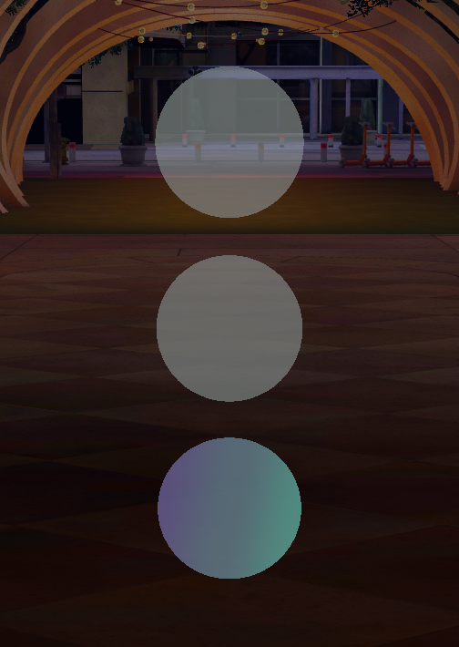
SwitchToggleGroup for Switches
The SwitchToggleGroup component is essentially identical to a ToggleGroup, except you attach
Switch components instead of toggle buttons. Its list of members is called Switches
instead of Toggles; its other properties are the same.
Toggle Group Inspector properties
| Property | Description |
|---|---|
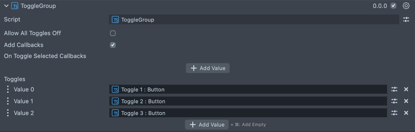
| Allow All Toggles Off | Allows the group to have no toggles selected. The default is false. |
| Add Callbacks | Adds the editor hooks for the event callbacks to the element. |
| On Toggle Selected Callbacks | (shows if Add Callbacks is checked) Fires a callback event any time one of the attached toggles is selected. |
| Toggles | The in-panel interface for attaching toggles to this group. Toggles added here are managed by this ToggleGroup. On a SwitchToggleGroup, this list is Switches. |
Create a Toggle Group from a script
The script below creates a ToggleGroup and eight round toggle buttons, registers each button with
the group, and prints the name of the selected one. Each button is made toggleable with
setIsToggleable(true) and gets its shape from setVariant(), both before initialize().
registerToggleable(toggle, value) takes an optional second argument, a value that the
onToggleSelected event passes back as args.value. A ToggleGroup also has
deregisterToggleable(toggle) to remove a member, and resetToggleGroup(), which resets every
member so that only the toggle at index firstOnToggle is on. Unless Allow All Toggles Off is
checked, the group turns on its first toggle when none is on.
- TypeScript
- JavaScript
import { ToggleGroup } from 'UIKit.lspkg/Scripts/Components/Toggle/ToggleGroup';
import { Button } from 'UIKit.lspkg/Scripts/Components/Button/Button';

/**
 * A simple programmatic toggle group example
 */

@component
export class ExampleToggleGroupScript extends BaseScriptComponent {
  onAwake() {
    const toggleGroup = this.sceneObject.createComponent(
      ToggleGroup.getTypeName()
    ) as ToggleGroup;

    for (let i = 0; i < 8; i++) {
      const toggle = this.createToggle(i);
      toggleGroup.registerToggleable(toggle);
    }

    toggleGroup.onToggleSelected.add((args) => {
      print(`Toggle selected: ${args.toggleable.sceneObject.name}`);
    });
  }

  createToggle(index: number) {
    const object = global.scene.createSceneObject('Toggle ' + index);
    object.setParent(this.sceneObject);
    const toggle = object.createComponent(Button.getTypeName()) as Button;
    toggle.setVariant({ theme: 'System3', shape: 'Round' });
    toggle.setIsToggleable(true);
    toggle.width = 2;
    toggle.initialize();
    toggle.transform.setLocalPosition(new vec3(0, (index + 1) * 2.5, 0));
    return toggle;
  }
}
// Import required modules
const ToggleGroup =
  require('UIKit.lspkg/Scripts/Components/Toggle/ToggleGroup').ToggleGroup;
const Button =
  require('UIKit.lspkg/Scripts/Components/Button/Button').Button;

/**
 * A simple programmatic toggle group example
 */

function onAwake() {
  const toggleGroup = script.sceneObject.createComponent(
    ToggleGroup.getTypeName()
  );

  for (let i = 0; i < 8; i++) {
    const toggle = createToggle(i);
    toggleGroup.registerToggleable(toggle);
  }

  toggleGroup.onToggleSelected.add((args) => {
    print(`Toggle selected: ${args.toggleable.sceneObject.name}`);
  });
}

function createToggle(index) {
  const object = global.scene.createSceneObject('Toggle ' + index);
  object.setParent(script.sceneObject);
  const toggle = object.createComponent(Button.getTypeName());
  toggle.setVariant({ theme: 'System3', shape: 'Round' });
  toggle.setIsToggleable(true);
  toggle.width = 2;
  toggle.initialize();
  toggle.transform.setLocalPosition(new vec3(0, (index + 1) * 2.5, 0));
  return toggle;
}

// Start the script
onAwake();