Design for SPECS
How to design Lenses for SPECS, from how the display works to the UI system and the assets your Lens needs in Lens Explorer.
These guidelines cover how to design Lenses for SPECS: how the display works, how users interact with content around them, how to lay out and size UI, and what your Lens needs to stand out in Lens Explorer.
Introduction
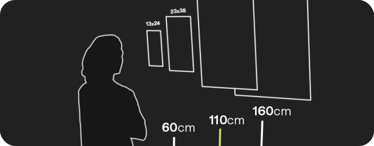
The SPECS display: its field of view, and how the additive display changes the colors you can use.
Read guide

Design Principles
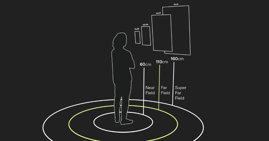
Interactions and target sizes, distances and units, frames and toolbars, navigation, and surface placement.
Read guide
Best Practices for Lenses
Onboarding users with a first time user experience, designing a hand menu, and other best practices.
Read guide

Publishing Guidelines
Lens Explorer asset requirements, and how to design a tile and an icon that get your Lens opened.
Read guide
Assets Optimization
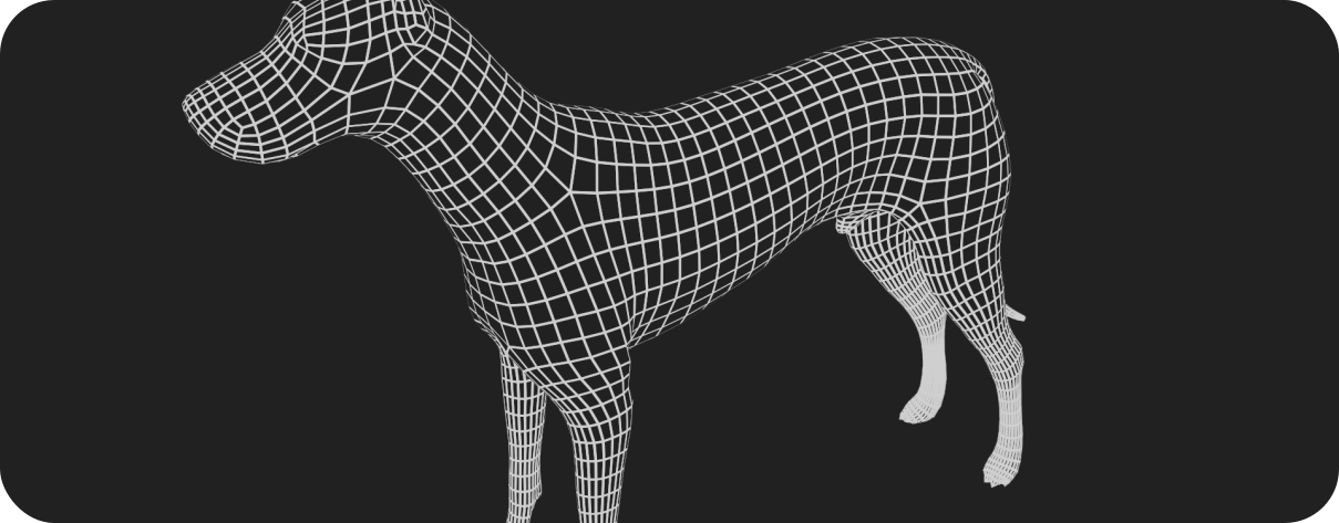
3D models, textures, shaders, animation, and draw calls: spending performance where users notice it.
Read guide
Design System 3.0
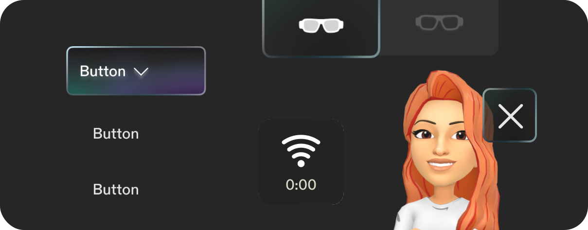
The design language, UI elements, and typography of SPECS.
Read guide
Key numbers
The values you'll reach for most often:
| Value | Details | |
|---|---|---|
| Default content distance | 110 cm | Distance & Units |
| Near-field distance | 60 cm | Interactions |
| Figma to real-world scale | 1 cm = 32 px at 110 cm | Distance & Units |
| Minimum target size | 3.5 cm at 110 cm, 2.5 cm at 60 cm | Target sizes and spacing |
| Minimum gap between targets | 0.5 cm | Target sizes and spacing |
| Frame size at 110 cm | 24 × 24 cm to 77 × 62.5 cm | Frame |
| Hue difference between colors | at least 30° | Additive Display and Color |
| White brightness | 80–90%, on at most 5–10% of the FoV | Additive Display and Color |
| Texture size | 512 × 512 or smaller | 3D Models and Textures |
Start in Lens Studio
Design in real-world units first and treat Figma as a reference. If you can, prototype in Lens Studio with UI Kit and the Interaction Kit, so you settle the design and UX before the UI.
Build UX flows for SPECS in Figma with the Snap OS Design Kit: tokens, styles, components, and reference screens that match the system UI.