UI Elements
The Design System 3.0 components for SPECS: the FoV asset, frames, buttons, selection controls, sliders, inputs, toasts, lists, cards, and pickers.
Design System 3.0 in Figma is measured for 110 cm, where 1 cm = 32 px. Support for 60 cm is planned. To build these elements in a Lens, use UI Kit.
FoV
The FoV is an asset in the Design System 3.0 library. It's built with slots, so you can design inside it without breaking the components.
The FoV component is 2160 × 2588 px, twice the size of the actual SPECS FoV, plus padding. It represents the FoV at 110 cm, where the two displays fully overlap. See Field of View.

Frame
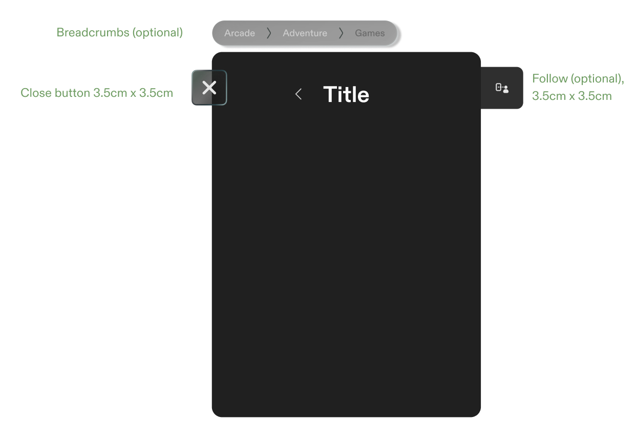
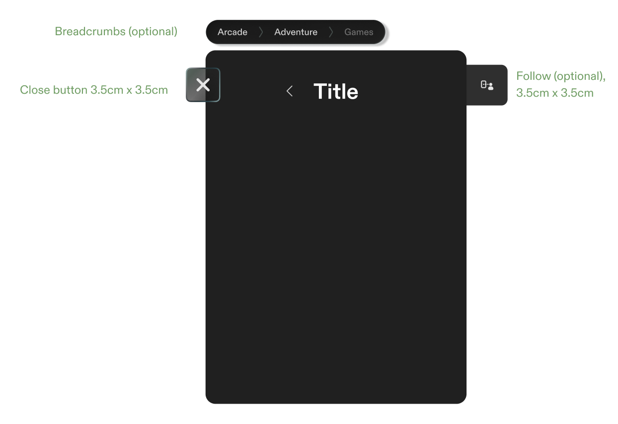
- Title
- Close button: 3.5 × 3.5 cm
- Follow button (optional): 3.5 × 3.5 cm
- Breadcrumbs (optional). See Navigation.
For frame behaviors and size limits, see Frame.
Buttons
- Minimum size: 3.75 × 3.75 cm.
- Full-width buttons: fill the available width, at a height of 3.75 cm.
Button styles, from most to least prominent:
- Primary CTA: the main action.
- Secondary CTA: an outlined button for other actions.
- Ghost: a label without a container.
- Floating (main): a standalone call to action, such as Discover.
- Floating (system level) and Floating (Lens level): close buttons, with and without a container.
Checkboxes, radio buttons, and toggles
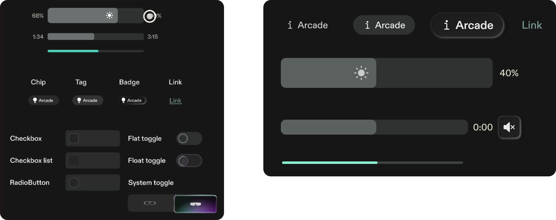
The library includes a checkbox, a checkbox list, a radio button, and three toggles: flat, float, and system. A system toggle switches between two icons, such as microphone on and off.
Sliders, chips, and progress bars
- Sliders: a value slider, such as brightness, and a media scrubber with elapsed and total time.
- Progress bars: a thin bar for progress that the user doesn't control.
- Chips, tags, badges, and links: small labels for categories and actions.
Inputs and button groups
- Toolbars: for example, a media player toolbar with playback, volume, and actions.
- Text input and search fields, with a microphone button for voice input.
- Button groups: up to three related actions grouped together, such as like, delete, and send.
- Dropdowns: a button that expands into a list of options.
- Breadcrumbs: see Navigation.
Toasts and lists
- Toasts: a title, a message, an optional image, and up to two buttons.
- List items: a title, subtext, an optional image, and a trailing control or chevron.
Cards
Lens cards come in default, square, and hero layouts.
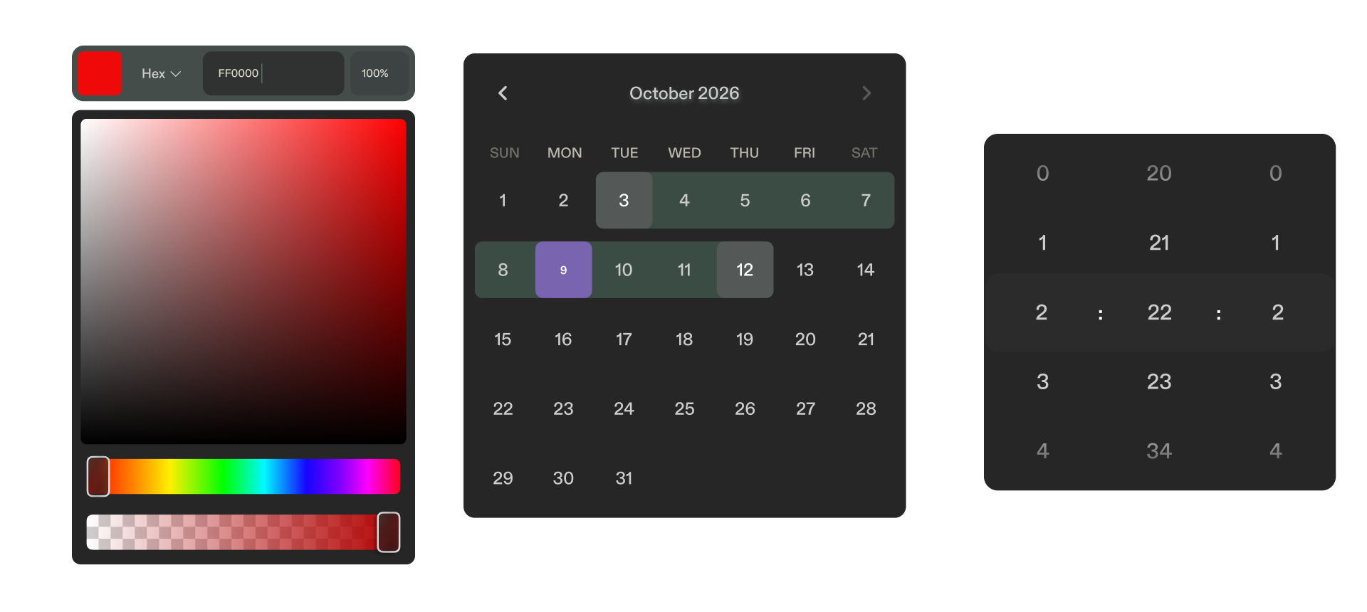
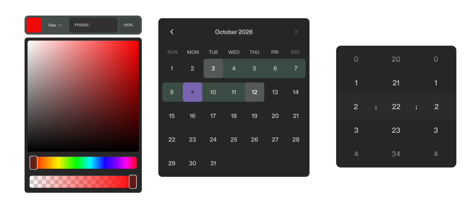
Calendar, color picker, and date picker