Frame
Every SPECS UI sits in a frame. Frame variants, structure, behaviors, and size limits, plus the toolbars attached to frames and how many frames to show at once.
Every UI should have a frame. To build one, use UI Kit's Frame.
Frame variants
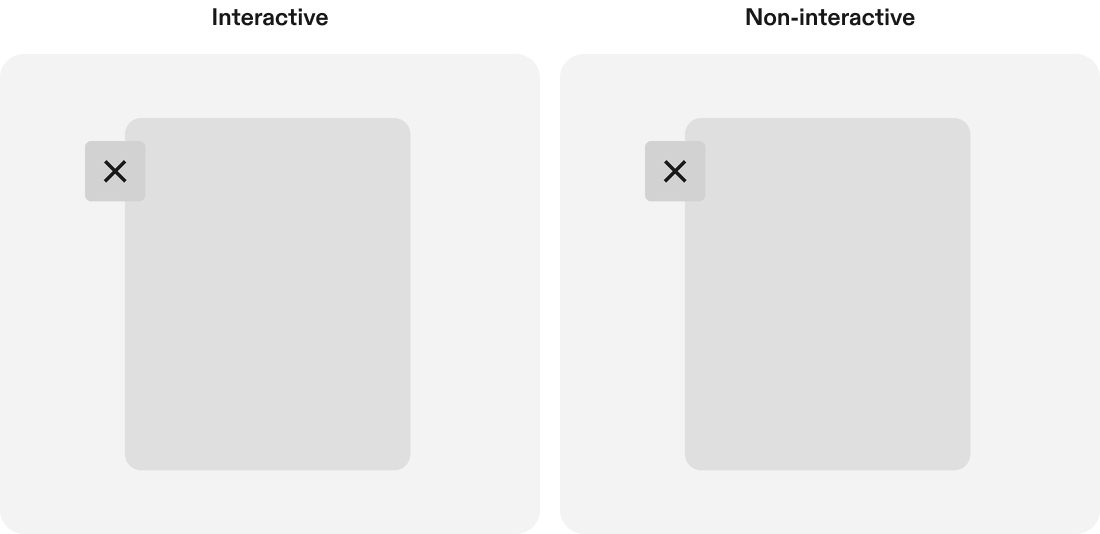
A frame is one of two types:
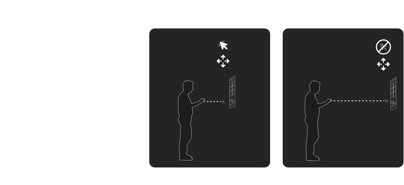
- Interactive: users can move it freely along the X, Y, and Z axes, and resize it.
- Non-interactive: users can't move, resize, or rotate it. It stays at a set distance from the user.
Structure
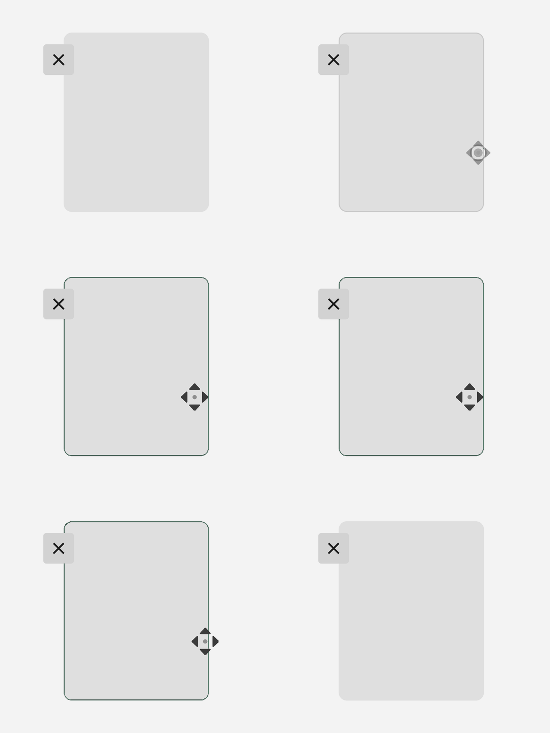
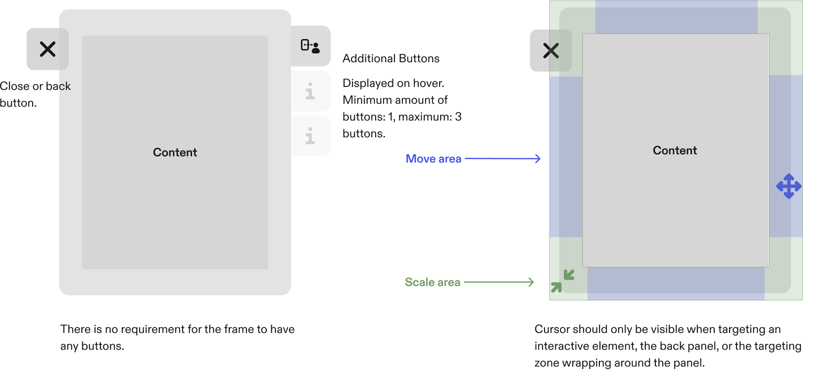
- Close or back button: optional. A frame doesn't need any buttons.
- Additional buttons: displayed on hover, one to three at most.
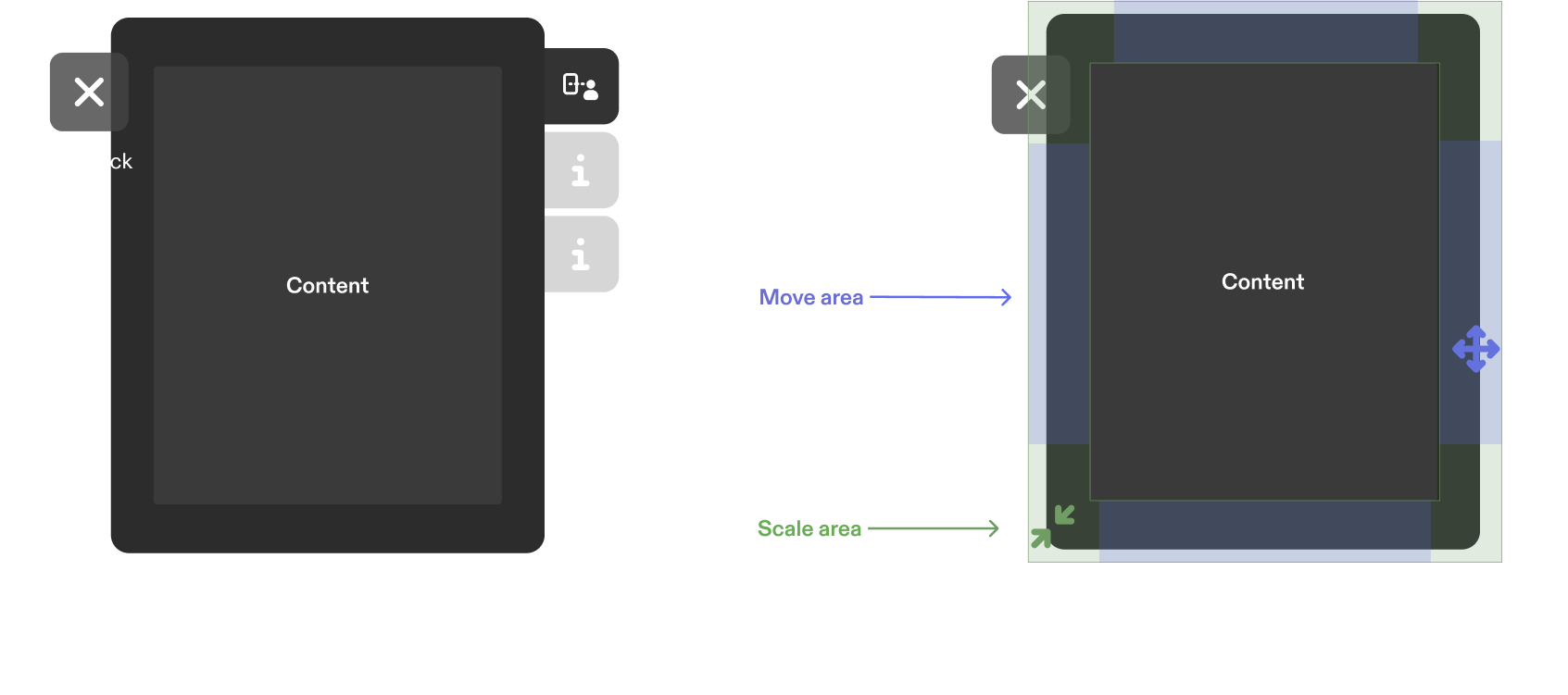
- Move area: the edges of the frame, which the user grabs to move it.
- Scale area: the corners of the frame, which the user grabs to resize it.
- Cursor: visible only when the user targets an interactive element, the back panel, or the targeting zone wrapping around the panel.
Visual bounds vs hit area
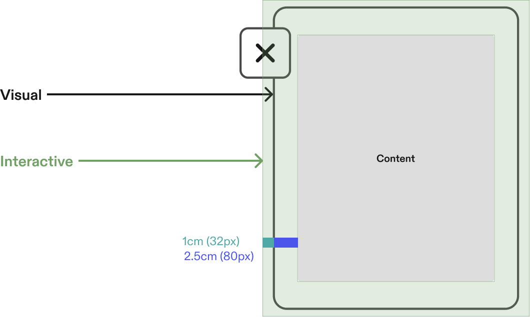
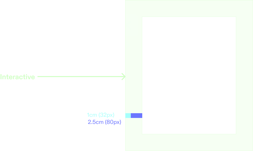
The frame's interactive area extends past its visible edge, so a pinch or poke that lands just outside the frame still registers. The same applies to every interactable inside it; see Target sizes and spacing.
- Collider: at least 3.5 cm for content at 110 cm, and at least 2.5 cm at 60 cm.
Frame behaviors
| Behavior | What it does | Use when |
|---|---|---|
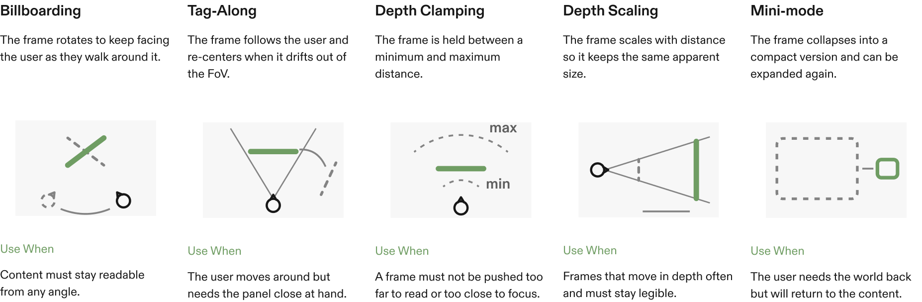
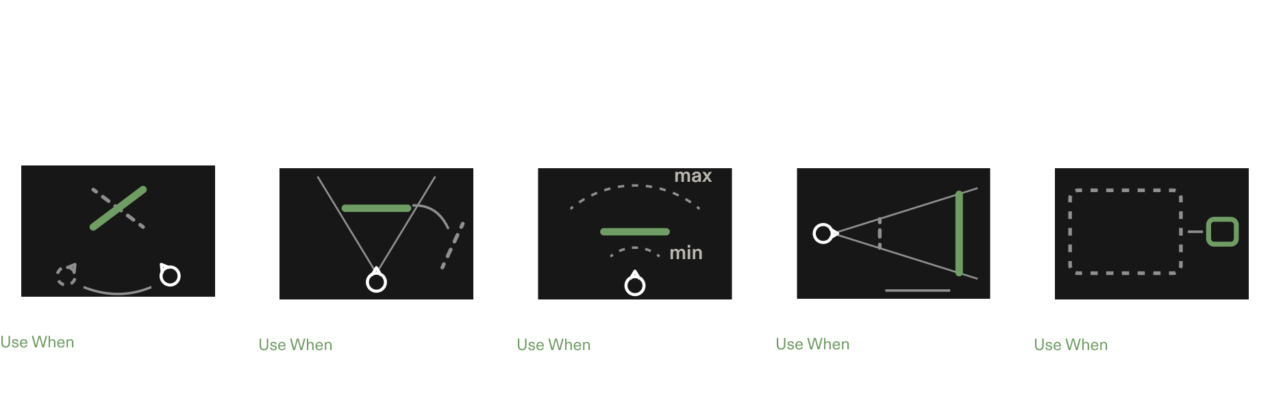
| Billboarding | The frame rotates to keep facing the user as they walk around it. | Content must stay readable from any angle. |
| Tag-along | The frame follows the user and re-centers when it drifts out of the FoV. | The user moves around but needs the panel close at hand. |
| Depth clamping | The frame is held between a minimum and a maximum distance. | A frame must not be pushed too far to read or too close to focus on. |
| Depth scaling | The frame scales with distance so it keeps the same apparent size. | Frames move in depth often and must stay legible. |
| Mini-mode | The frame collapses into a compact version and can be expanded again. | The user needs the world back but will return to the content. |
Size and distance limits
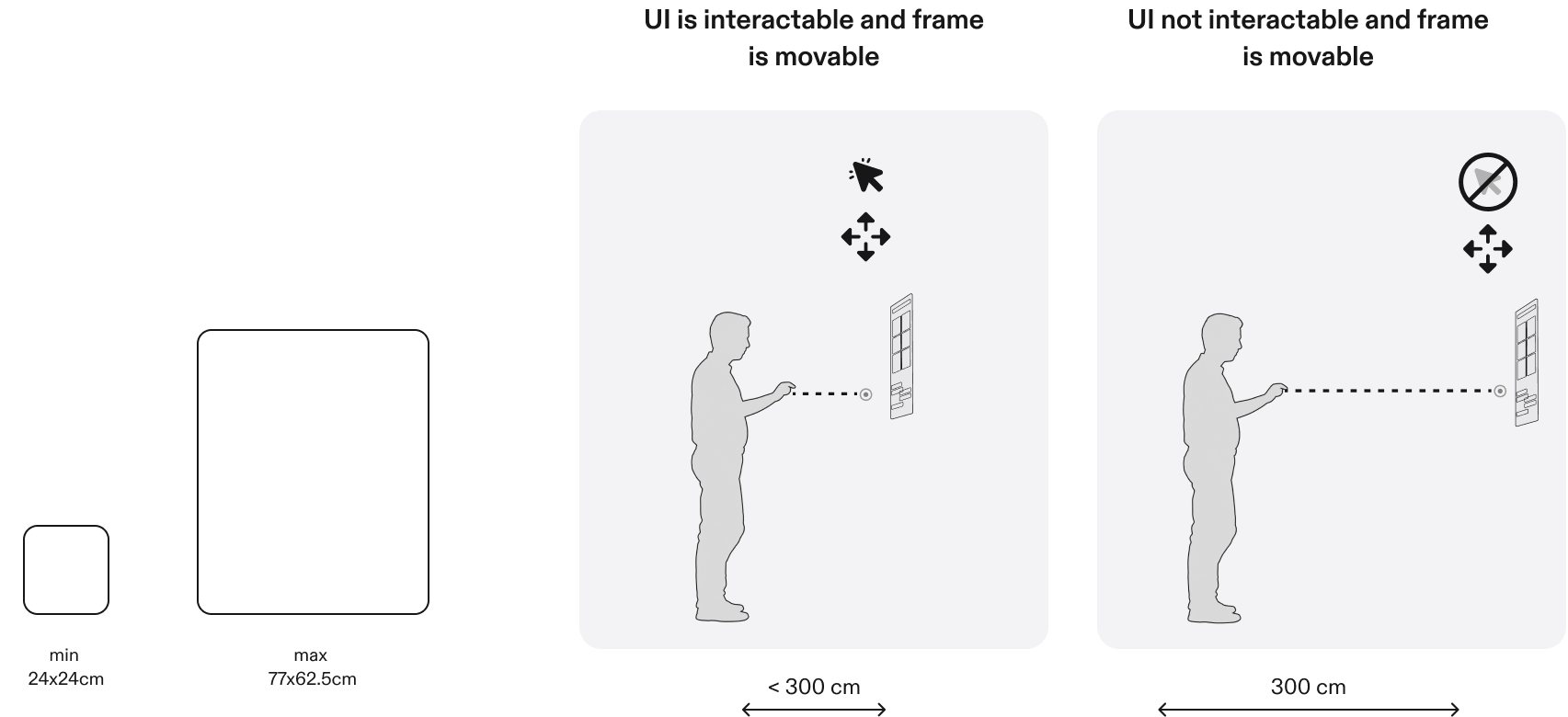
The UI inside a frame stays interactive while the user is within 300 cm of it. At 300 cm and beyond, users can still move the frame, but they can't interact with its UI.
At 110 cm:
- Minimum: don't make a frame smaller than 24 × 24 cm.
- Maximum: don't make a frame bigger than 77 × 62.5 cm. You can, but it doesn't make sense for interaction: once the frame spills outside the FoV, moving it gets hard and the user has to step back from it.
Toolbars
A toolbar runs along the edge of a frame and holds its primary actions.
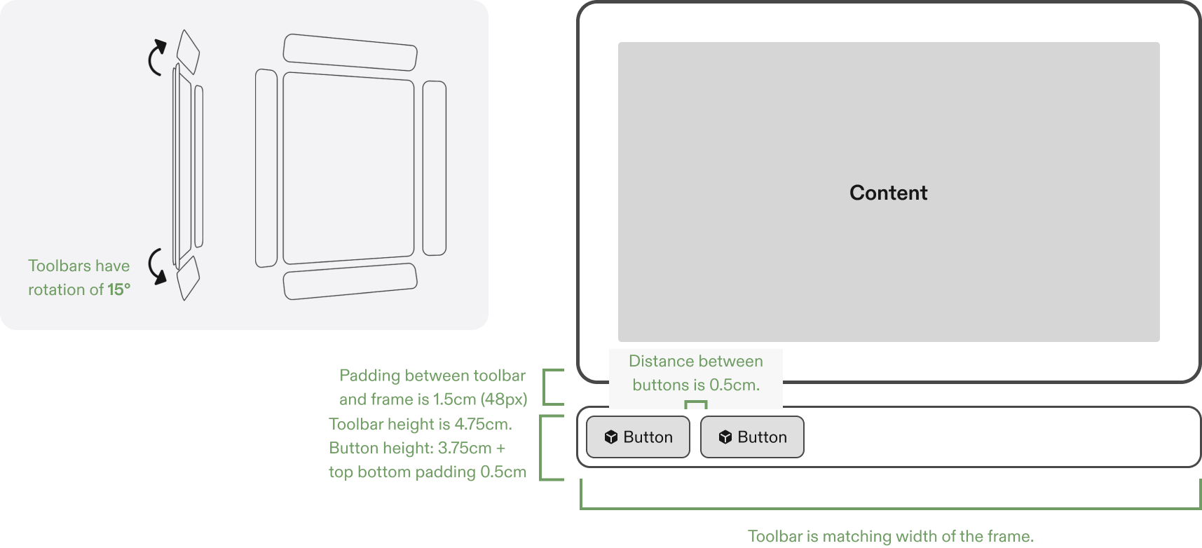
- The toolbar matches the width of the frame.
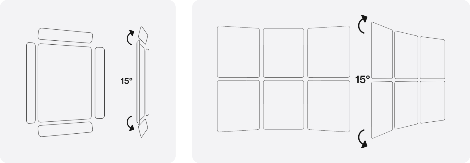
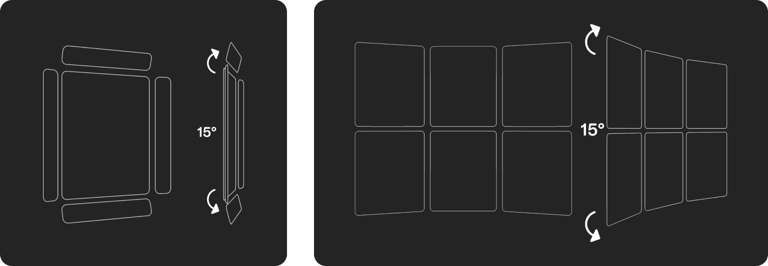
- Rotate toolbars 15° toward the user for better ergonomics.
- The toolbar is 4.75 cm high: a 3.75 cm button plus 0.5 cm padding at the top and bottom.
- Space buttons 0.5 cm apart.
- Leave 1.5 cm (48 px) between the toolbar and the frame.
Multiple windows
A Lens can show one to six frames at once. As a best practice, show no more than three. Rotate their toolbars and navigation 15°, as for a single frame.