Frame
Reference for the UI Kit 4.0.0 Frame component: a movable, resizable panel that backs and groups UI content in a SPECS Lens, with close and follow buttons and depth behavior.
- Snapchat: not supported
- SPECS: fully supported
- Camera Kit Web: not supported
- Camera Kit Mobile: not supported
- SnapchatNot supported
- SPECSFully supported
- Camera Kit WebNot supported
- Camera Kit MobileNot supported
The UI Kit Frame component is a panel that helps situate content in AR space. If you have some
text, an alert, or a dialog, but you don't want it to float without any context, put it in a
Frame: the Frame draws a backing around the content and lets people move it, resize it, and have it
follow them. Frame is also the UI Kit 4.0.0 replacement for the deprecated
BackPlate when the backing is a panel.
When a Frame starts, it moves the existing children of its scene object into a generated content
object, so content you place under the Frame's object becomes the Frame's content.
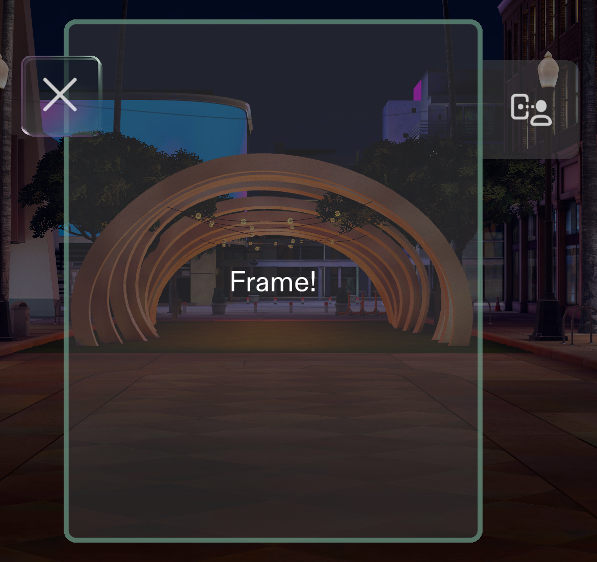
The Frame's look
The Frame uses the System 3.0 theme: a panel with a single, fixed appearance. Its close button
sits at its top-left corner, and its follow button lives in a drawer on its right edge. The panel
body stays opaque, and the drawer slides out on hover. To also fade the body in on hover and out
when idle, set frame.autoShowHide = true in a script after the Frame initializes.
UI Kit 4.0.0 removed the System 2.0 theme, and with it the Frame's Auto Show Hide and
Appearance (Large and Small) Inspector fields and Frame.roundedRectangle. See the
Release Notes.
Frame Inspector properties
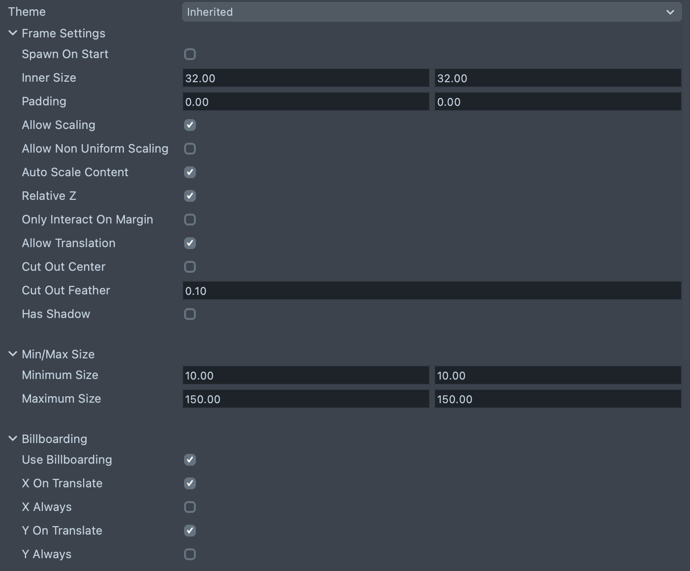
The Inspector groups the Frame's properties. Their labels, in order:
| Property | Description |
|---|---|
| Theme | The theme the Frame uses: Inherited (the default, follows the global theme) or System 3.0. |
| Spawn On Start | Plays the Horizon Reveal spawn animation when the Frame starts. Off by default. |
| Inner Size | Sets the size of the Frame's inner content area in local space centimeters. X is width, and Y is height. The default is 32 × 32. |
| Padding | Sets additional padding on the Frame in centimeters. X is width, and Y is height. This padding is not affected by the resize interaction by dragging the corners, which makes it useful for adding constant-sized UI to your Frame, like a toolbar. |
| Allow Scaling | Turns on the corner dragging scale behavior for the Frame. On by default. |
| Allow Non Uniform Scaling | (shows if Allow Scaling is checked) Lets width and height scale independently, within the minimum and maximum sizes. |
| Auto Scale Content | Rescales the content of the Frame along with the Frame's scale behavior. On by default. |
| Relative Z | Scales the content on the Z axis too during the Frame's scale behavior. It is useful to turn this off to maintain the Z depth of your content. |
| Only Interact On Margin | Makes it so you can only control the Frame on its margin. This is useful if you don't want the drag behavior on the Frame when pinching in its center. |
| Allow Translation | Enables the drag to reposition behavior on the Frame. |
| Cut Out Center | Makes the center of the Frame transparent, so content behind the Frame shows through and only the border stays visible. |
| Cut Out Feather | The softness of the cut-out center's edge, in local centimeters. The default is 0.1. |
| Has Shadow | Draws a soft drop shadow behind the Frame's body. |
| Minimum Size | The minimum size that the Frame can be scaled to with its drag behavior. The default is 10 × 10. |
| Maximum Size | The maximum size that the Frame can be scaled to with its drag behavior. The default is 150 × 150. |
| Use Billboarding | Makes the Frame rotate to face the user. On by default. |
| X On Translate | (shows if Use Billboarding is checked) Billboards on the X axis during Frame translation. |
| X Always | (shows if X On Translate is checked) Billboards on the X axis always. |
| X Buffer Degrees | (shows if X Always is checked) How many degrees the Frame can turn away on the X axis before it billboards. |
| Y On Translate | (shows if Use Billboarding is checked) Billboards on the Y axis during Frame translation. |
| Y Always | (shows if Y On Translate is checked) Billboards on the Y axis always. |
| Y Buffer Degrees | (shows if Y Always is checked) How many degrees the Frame can turn away on the Y axis before it billboards. |
| Use Snapping | Enables the Frame's snapping behavior options. |
| Item Snapping | (shows if Use Snapping is checked) Enables Frame-to-Frame snapping behavior. Depth Clamping and Depth Scaling are turned off while it is active. |
| World Snapping | (shows if Use Snapping is checked) Enables Frame-to-World snapping to physical surfaces. |
| Use Tag-Along Mode | (hidden while Show Follow Button is checked) Keeps the Frame still during small head movements and moves it back in front of the user after larger turns, in place of the follow behavior. |
| Follow Distance | (shows if Use Tag-Along Mode is checked) The distance in centimeters at which the Frame repositions in front of the user. The default is 110. |
| Show Follow Button | (hidden while Use Tag-Along Mode is checked) Turns on the Frame's Follow Button. |
| Use Focus Frame | Moves the whole Frame toward the system keyboard while a text field inside it is being edited, and pauses the follow behavior until editing ends. On by default. |
| Use Built-In Follow Behavior | (shows if Show Follow Button is checked) Activates the built-in following behavior, which keeps the Frame in front of the user's view, when the follow button is toggled on. |
| Use Tilt Mode | (shows if Use Built-In Follow Behavior is checked) Switches the follow behavior to gaze tracking when the user looks up or down past the thresholds. |
| Tilt Up Threshold (degrees) | (shows if Use Tilt Mode is checked) The upward head pitch at which gaze tracking starts. The default is 25. |
| Tilt Down Threshold (degrees) | (shows if Use Tilt Mode is checked) The downward head pitch at which gaze tracking starts. The default is 35. |
| Following | (shows if Use Built-In Follow Behavior is checked) Toggles on the follow button and the built-in behavior, so the Frame follows the user immediately. |
| Enable Depth Clamping | Keeps the grabbed point between a minimum and maximum depth from the camera while the Frame is moved. Has no effect while Allow Translation is off (unless Force Translate is on), and isn't supported together with Item Snapping. |
| Minimum Depth (cm) | (Depth Clamping, shows if Enable Depth Clamping is checked) The closest allowed depth. The default is 35. |
| Maximum Depth (cm) | (Depth Clamping, shows if Enable Depth Clamping is checked) The farthest allowed depth. The default is 110. |
| Enable Depth Scaling | Scales the Frame uniformly as its depth from the camera changes when it moves; moving only the camera doesn't resize a Frame that stands still. Independent of Allow Scaling, and not supported together with Item Snapping. |
| Minimum Depth (cm) | (Depth Scaling, shows if Enable Depth Scaling is checked) The near end of the depth scaling curve. The default is 35. |
| Maximum Depth (cm) | (Depth Scaling, shows if Enable Depth Scaling is checked) The far end of the depth scaling curve. The default is 110. |
| Minimum Scale | (shows if Enable Depth Scaling is checked) The scale at or nearer than the minimum depth. The default is 0.5. |
| Maximum Scale | (shows if Enable Depth Scaling is checked) The scale at or farther than the maximum depth. The default is 1. |
| Show Close Button | Turns on the Frame's Close Button. This does not come with a built-in behavior: attach to the button to define your close behavior (see Handle the Frame's close button). |
| Enable Interaction Plane | Turns on an Interaction Kit InteractionPlane for the Frame (on by default). An InteractionPlane defines a zone which triggers near field targeting logic for hand interactors; see Interaction System. |
| Interaction Plane Offset | (shows if Enable Interaction Plane is checked) A translation offset for the interaction plane trigger volume. |
| Interaction Plane Padding | (shows if Enable Interaction Plane is checked) A padding to extend the interaction plane trigger volume beyond the size parameters of the element. |
| Targeting Visual | (shows if Enable Interaction Plane is checked) Which targeting visual the interaction plane uses when it is activated: None, Cursor (the default), or Ray. |
| Interactable Padding | Padding added to the Frame's interaction collider on each side (X horizontal, Y vertical), which widens the grab band without changing the visible size. The default is 1 × 1. |
The Frame in UI Kit 4.0.0 renamed Only Interact On Border to Only Interact On Margin; in
code, onlyInteractOnBorder is deprecated in favor of onlyInteractOnMargin.
Create a Frame from a script
A Frame initializes itself when it starts; it has no initialize() method to call. Its generated
parts, such as its content object and its buttons, exist only after it initializes, so set its
size and reach its internals in an onInitialized handler. onInitialized replays for handlers
added after the Frame initialized, so the handler runs either way.
For content you size in code, as in this example, consider turning off Auto Scale Content
(autoScaleContent = false) unless your content adjusts its own layout when the Frame resizes.
- TypeScript
- JavaScript
import { Frame } from 'UIKit.lspkg/Scripts/Components/Frame/Frame';

/**
 * Example script for the Frame component.
 * It creates a frame and sets its size once the frame has initialized.
 */

@component
export class ExampleFrameScript extends BaseScriptComponent {
  onAwake() {
    this.createContent();
    const frame = this.sceneObject.createComponent(
      Frame.getTypeName()
    ) as Frame;
    frame.onInitialized.add(() => {
      frame.innerSize = new vec2(15, 20);
    });
  }

  createContent() {
    const child = global.scene.createSceneObject('Child');
    child.setParent(this.sceneObject);
    const text = child.createComponent('Text');
    text.text = 'Frame!';
    text.size = 200;
    const screenTransform = child.createComponent('ScreenTransform');
    screenTransform.anchors = Rect.create(-1, 1, -1, 1);
    screenTransform.offsets.setSize(new vec2(15, 20));
    screenTransform.position = new vec3(0, 0, 0.01);
  }
}
// Import required modules
const Frame =
  require('UIKit.lspkg/Scripts/Components/Frame/Frame').Frame;

/**
 * Example script for the Frame component.
 * It creates a frame and sets its size once the frame has initialized.
 */

function onAwake() {
  createContent();
  const frame = script.sceneObject.createComponent(Frame.getTypeName());
  frame.onInitialized.add(() => {
    frame.innerSize = new vec2(15, 20);
  });
}

function createContent() {
  const child = global.scene.createSceneObject('Child');
  child.setParent(script.sceneObject);
  const text = child.createComponent('Text');
  text.text = 'Frame!';
  text.size = 200;
  const screenTransform = child.createComponent('ScreenTransform');
  screenTransform.anchors = Rect.create(-1, 1, -1, 1);
  screenTransform.offsets.setSize(new vec2(15, 20));
  screenTransform.position = new vec3(0, 0, 0.01);
}

// Start the script
onAwake();
Handle the Frame's close button
The Frame's close button does not have a built-in behavior. You need to define what happens when a user triggers it. Common actions include hiding or destroying the Frame.
- In Lens Studio, select the scene object that has your Frame component.
- In the Inspector, check Show Close Button. Without it, the Frame creates no close button for your script to listen to.
- Create a new script and attach it to the same scene object (or a parent).
- Use the
@inputdecorator to reference your Frame component, and assign the Frame to it in the Inspector. - Add an event handler to the close button's
onTriggerUpevent inside the Frame'sonInitializedhandler, because the close button exists only once the Frame has initialized.
- TypeScript
- JavaScript
import { Frame } from 'UIKit.lspkg/Scripts/Components/Frame/Frame';

@component
export class CloseButtonExample extends BaseScriptComponent {
  // Reference to the Frame component - assign this in the Inspector panel
  @input
  frame: Frame;

  onAwake() {
    // Wait for the Frame to initialize before accessing the close button
    this.frame.onInitialized.add(() => {
      this.frame.closeButton.onTriggerUp.add(() => {
        print('Close button triggered!');
      });
    });
  }
}
// Reference to the Frame component - assign this in the Inspector panel
// @input Component.ScriptComponent frame {"hint": "Frame component reference"}

// Wait for the Frame to initialize before accessing the close button
script.frame.onInitialized.add(function () {
  script.frame.closeButton.onTriggerUp.add(function () {
    print('Close button triggered!');
  });
});
Related pages for the UI Kit Frame
- Backplate: the deprecated backing that Frame replaces, and the lightweight RoundedRectangle alternative.
- ScrollWindow: scroll long content inside a Frame.
- TextInputField: text fields that move their Frame toward the keyboard.
- Interaction System: the Interaction Plane a Frame creates around its content.