Custom Visual
Replace the default look of a UI Kit 4.0.0 component with a custom visual, such as a RoundedRectangleVisual with your own gradients for each interaction state.
- Snapchat: not supported
- SPECS: fully supported
- Camera Kit Web: not supported
- Camera Kit Mobile: not supported
- SnapchatNot supported
- SPECSFully supported
- Camera Kit WebNot supported
- Camera Kit MobileNot supported
You can swap out the default visual for a UI Kit component by creating a custom visual. This page
shows how to do this in TypeScript for a Button, for developers who need a look that the UI Kit
themes don't provide. To change a button between the looks UI Kit already has, set its Theme,
Shape, and Style instead (see Button); a custom visual replaces the theme's
styling for that component.
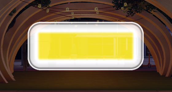
How a custom visual replaces a UI Kit component's default visual
A UI Kit visual element draws itself through a Visual (see Architecture).
When it initializes, it creates a default Visual from its theme, unless one is already assigned.
To use your own, create a Visual and set the element's visual property before you call
initialize().
A RoundedRectangleVisual takes a style with one entry per interaction state. Each state is a
RoundedRectangleVisualState: the fill (baseType of 'Color', 'Gradient', or
'Texture', with baseColor, baseGradient, or baseTexture) and an optional border
(hasBorder, borderSize, borderType, borderColor or borderGradient). The state
names come from the StateName enum: default,
hovered, triggered, inactive, error, errorHovered, toggledDefault,
toggledHovered, and toggledTriggered.
Besides RoundedRectangleVisual, UI Kit 4.0.0 includes BeveledPrismVisual, which the System 3.0
Prism styles use.
Apply a custom visual to a Button
The script below finds the Button on its own scene object, builds a RoundedRectangleVisual
with a gradient for the default, hovered, and triggered states, assigns it, and then
initializes the button. Put it on the same scene object as the Button.
- TypeScript
- JavaScript
import { Button } from 'UIKit.lspkg/Scripts/Components/Button/Button';
import {
  RoundedRectangleVisual,
  RoundedRectangleVisualState,
} from 'UIKit.lspkg/Scripts/Visuals/RoundedRectangle/RoundedRectangleVisual';
import { StateName } from 'UIKit.lspkg/Scripts/Components/Element';

const COLORS = {
  // More saturated yellow, black, white with rich tonal variations
  lightYellow: new vec4(1.0, 0.99, 0.75, 1), // #FFFC40 - Rich cream yellow
  yellow: new vec4(0.95, 0.88, 0.15, 1), // #F2E026 - Vibrant yellow
  darkYellow: new vec4(0.8, 0.7, 0.0, 1), // #CCB300 - Deep golden yellow

  white: new vec4(0.99, 0.99, 0.99, 1), // #FCFCFC - Bright white
  lightGray: new vec4(0.88, 0.88, 0.88, 1), // #E0E0E0 - Light gray
  darkGray: new vec4(0.2, 0.2, 0.2, 1), // #333333 - Dark gray
  black: new vec4(0.02, 0.02, 0.02, 1), // #050505 - Rich black
};

/**
 * ExampleButtonCustomVisual is a script that applies a custom visual to a button.
 * It uses the RoundedRectangleVisual class to create a rounded rectangle with a custom visual.
 */

@component
export class ExampleButtonCustomVisual extends BaseScriptComponent {
  onAwake() {
    const button = this.sceneObject.getComponent(
      Button.getTypeName()
    ) as Button;
    const customStyle: Partial<Record<StateName, RoundedRectangleVisualState>> =
      {
        default: {
          baseType: 'Gradient',
          hasBorder: true,
          borderSize: 0.125,
          borderType: 'Color',
          borderColor: COLORS.lightGray,
          baseGradient: {
            enabled: true,
            type: 'Rectangle',
            stop0: { enabled: true, percent: 0, color: COLORS.white },
            stop1: { enabled: true, percent: 0.3, color: COLORS.lightGray },
            stop2: { enabled: true, percent: 0.7, color: COLORS.darkGray },
            stop3: { enabled: true, percent: 1.0, color: COLORS.black },
          },
        },
        hovered: {
          baseGradient: {
            enabled: true,
            type: 'Rectangle',
            stop0: { enabled: true, percent: 0, color: COLORS.lightYellow },
            stop1: { enabled: true, percent: 0.2, color: COLORS.yellow },
            stop2: { enabled: true, percent: 0.6, color: COLORS.darkYellow },
            stop3: { enabled: true, percent: 1.0, color: COLORS.darkGray },
          },
        },
        triggered: {
          baseGradient: {
            enabled: true,
            type: 'Rectangle',
            stop0: { enabled: true, percent: 0, color: COLORS.yellow },
            stop1: { enabled: true, percent: 0.3, color: COLORS.white },
            stop2: { enabled: true, percent: 0.7, color: COLORS.lightGray },
            stop3: { enabled: true, percent: 1.0, color: COLORS.black },
          },
        },
      };
    const customVisual = new RoundedRectangleVisual({
      sceneObject: button.sceneObject,
      style: customStyle,
    });

    button.visual = customVisual;
    button.initialize();
  }
}
// Import required modules
const Button =
  require('UIKit.lspkg/Scripts/Components/Button/Button').Button;
const RoundedRectangleVisual =
  require('UIKit.lspkg/Scripts/Visuals/RoundedRectangle/RoundedRectangleVisual').RoundedRectangleVisual;

const COLORS = {
  // More saturated yellow, black, white with rich tonal variations
  lightYellow: new vec4(1.0, 0.99, 0.75, 1), // Rich cream yellow
  yellow: new vec4(0.95, 0.88, 0.15, 1), // Vibrant yellow
  darkYellow: new vec4(0.8, 0.7, 0.0, 1), // Deep golden yellow

  white: new vec4(0.99, 0.99, 0.99, 1), // Bright white
  lightGray: new vec4(0.88, 0.88, 0.88, 1), // Light gray
  darkGray: new vec4(0.2, 0.2, 0.2, 1), // Dark gray
  black: new vec4(0.02, 0.02, 0.02, 1), // Rich black
};

/**
 * ExampleButtonCustomVisual is a script that applies a custom visual to a button.
 * It uses the RoundedRectangleVisual class to create a rounded rectangle with a custom visual.
 */

function onAwake() {
  const button = script.sceneObject.getComponent(Button.getTypeName());
  const customStyle = {
    default: {
      baseType: 'Gradient',
      hasBorder: true,
      borderSize: 0.125,
      borderType: 'Color',
      borderColor: COLORS.lightGray,
      baseGradient: {
        enabled: true,
        type: 'Rectangle',
        stop0: { enabled: true, percent: 0, color: COLORS.white },
        stop1: { enabled: true, percent: 0.3, color: COLORS.lightGray },
        stop2: { enabled: true, percent: 0.7, color: COLORS.darkGray },
        stop3: { enabled: true, percent: 1.0, color: COLORS.black },
      },
    },
    hovered: {
      baseGradient: {
        enabled: true,
        type: 'Rectangle',
        stop0: { enabled: true, percent: 0, color: COLORS.lightYellow },
        stop1: { enabled: true, percent: 0.2, color: COLORS.yellow },
        stop2: { enabled: true, percent: 0.6, color: COLORS.darkYellow },
        stop3: { enabled: true, percent: 1.0, color: COLORS.darkGray },
      },
    },
    triggered: {
      baseGradient: {
        enabled: true,
        type: 'Rectangle',
        stop0: { enabled: true, percent: 0, color: COLORS.yellow },
        stop1: { enabled: true, percent: 0.3, color: COLORS.white },
        stop2: { enabled: true, percent: 0.7, color: COLORS.lightGray },
        stop3: { enabled: true, percent: 1.0, color: COLORS.black },
      },
    },
  };
  const customVisual = new RoundedRectangleVisual({
    sceneObject: button.sceneObject,
    style: customStyle,
  });

  button.visual = customVisual;
  button.initialize();
}

// Start the script
onAwake();
Related pages for UI Kit custom visuals
- Architecture: how Elements, Visuals, and VisualElements fit together.
- Extend Component: subclass a component and create its visual in code.
- Button: the theme styles a custom visual replaces.