Slider
Reference for the UI Kit 4.0.0 Slider component: pick a value between 0 and 1 by dragging in a SPECS Lens, with segments, a track fill, a knob icon, and value events.
- Snapchat: not supported
- SPECS: fully supported
- Camera Kit Web: not supported
- Camera Kit Mobile: not supported
- SnapchatNot supported
- SPECSFully supported
- Camera Kit WebNot supported
- Camera Kit MobileNot supported
The UI Kit Slider component lets people select a value within a range with a dragging
interaction. The value is normalized from 0 to 1, and the knob's position follows the current
value. The Slider emits onValueChange with the committed value and onKnobMoved continuously
while the knob moves. It can animate the knob to a new value: updateCurrentValue(value, true)
springs the knob there.
On the System 3.0 theme, the Slider element itself is the track and there is no separate knob. A slider taller than about 1.6 cm renders as a slab, so keep its height small.

Slider Inspector properties
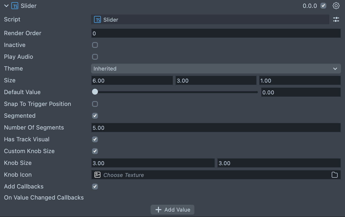
| Property | Description |
|---|---|
| Render Order | Sets the renderOrder for the visuals of the element. |
| Inactive | Makes the element ignore input and shows its inactive look. Think "grayed out." |
| Play Audio | Turns on the built-in audio cues for the element. |
| Theme | The theme the slider uses: Inherited (the default, follows the global theme) or System 3.0. |
| Size | Sets the size of the element in centimeters. X is width, Y is height and Z is the depth of the underlying collider. The default is 6 × 3 × 1. |
| Default Value | The starting value, between 0 and 1, for the knob of the slider and values of the slider. |
| Snap To Trigger Position | Enables a jump to trigger position behavior on the track. For example, if the knob is at 0 and you pinch around halfway on the track, the knob moves there automatically, with no need to drag. |
| Segmented | Enables a segmented (or digital) behavior for the slider. Instead of smoothly dragging, it subdivides the slider into stops. |
| Number Of Segments | (shows if Segmented is checked) Sets the number of segments from start to finish inclusive. For example, if you set this to 3, the three segments are 0, .5, and 1. The default is 5 and the minimum is 2. |
| Has Track Visual | Shows a fill on the track up to the knob's position. On by default. |
| Custom Knob Size | Turns on controls for the knob size. |
| Knob Size | (shows if Custom Knob Size is checked) Sets the size of the knob inside of the element. The default is 3 × 3. |
| Knob Icon | An optional icon drawn on the knob, which moves with it. Leave it empty for no icon. |
| Add Callbacks | Adds the editor hooks for the event callbacks to the element. |
| On Value Changed Callbacks | (shows if Add Callbacks is checked) A callback for when the element's value changes. |
Create a Slider from a script
The script below creates a slider, rotates it to stand vertically, and prints its value when it
changes. To set the value from your own state without firing onValueChange, call
resetToValue(value); updateCurrentValue(value) sets it and fires the event.
- TypeScript
- JavaScript
import { DegToRad } from 'InteractionKit.lspkg/Utils/mathUtils';
import { Slider } from 'UIKit.lspkg/Scripts/Components/Slider/Slider';

/**
 * A simple programmatic slider example
 */

@component
export class ExampleSliderScript extends BaseScriptComponent {
  onAwake() {
    const slider = this.sceneObject.createComponent(
      Slider.getTypeName()
    ) as Slider;
    slider.size = new vec3(20, 4, 1);
    slider.transform.setLocalRotation(
      quat.fromEulerVec(new vec3(0, 0, DegToRad * -90))
    );
    slider.initialize();
    slider.onValueChange.add((value) => {
      print(`Slider value changed to ${value}`);
    });
  }
}
// Import required modules
const DegToRad =
  require('InteractionKit.lspkg/Utils/mathUtils').DegToRad;
const Slider =
  require('UIKit.lspkg/Scripts/Components/Slider/Slider').Slider;

/**
 * A simple programmatic slider example
 */

function onAwake() {
  const slider = script.sceneObject.createComponent(Slider.getTypeName());
  slider.size = new vec3(20, 4, 1);
  slider.transform.setLocalRotation(
    quat.fromEulerVec(new vec3(0, 0, DegToRad * -90))
  );
  slider.initialize();
  slider.onValueChange.add((value) => {
    print(`Slider value changed to ${value}`);
  });
}

// Start the script
onAwake();
The example's slider is 4 cm tall. On System 3.0 a slider taller than about 1.6 cm renders as a slab, so use a height of 1.6 cm or less there.
Related pages for the UI Kit Slider
- Confirmation Slider: a slider that confirms a high-intent action.
- Switch: an on/off control built on the Slider.
- ScrollBar: a scroll bar that uses a Slider internally.