Switch
Reference for the UI Kit 4.0.0 Switch component: an on/off toggle switch for binary settings in SPECS Lenses, with System 3.0 styles, track markers, and value events.
- Snapchat: not supported
- SPECS: fully supported
- Camera Kit Web: not supported
- Camera Kit Mobile: not supported
- SnapchatNot supported
- SPECSFully supported
- Camera Kit WebNot supported
- Camera Kit MobileNot supported
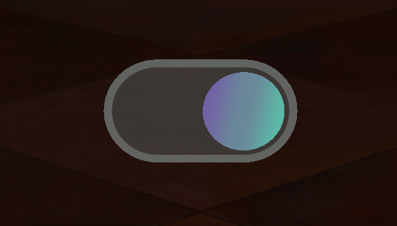
The UI Kit Switch component is a special kind of toggle element with a "switch" style visual and
interaction. It can be set to on or off, and it has its own specific toggle group,
SwitchToggleGroup (see Toggle Group).
Each switch has a knob (or thumb) and a track, plus a fill on the track. The Switch is built on the Slider, so it shares the Slider's knob and track settings.
Switch Inspector properties
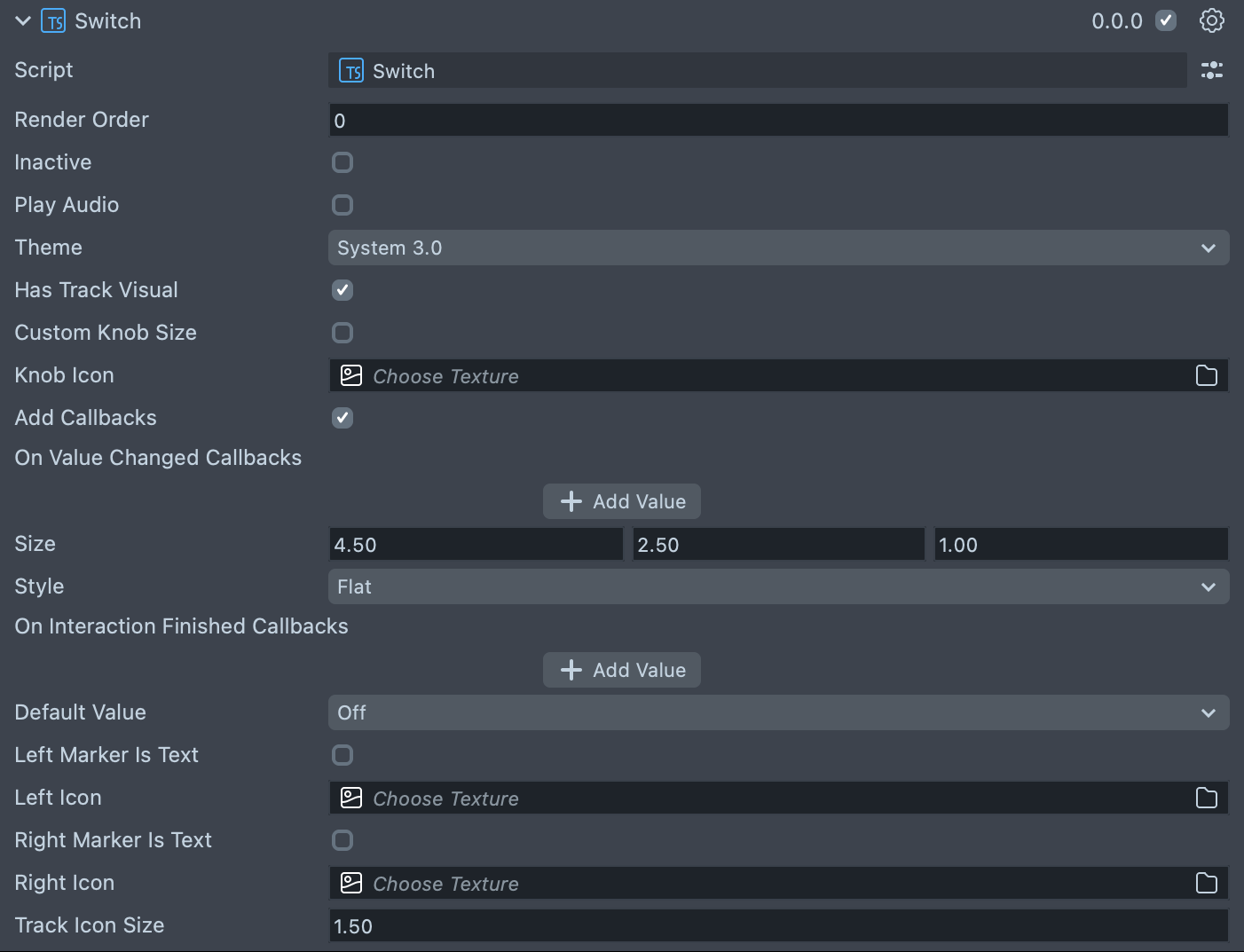
| Property | Description |
|---|---|
| Render Order | Sets the renderOrder for the visuals of the element. |
| Inactive | Makes the element ignore input and shows its inactive look. Think "grayed out." |
| Play Audio | Turns on the built-in audio cues for the element. |
| Theme | The theme the switch uses: Inherited (the default, follows the global theme) or System 3.0. |
| Has Track Visual | Shows the fill on the track up to the knob. On by default. |
| Custom Knob Size | Turns on controls for the knob size. |
| Knob Size | (shows if Custom Knob Size is checked) Set the size of the knob inside of the element. |
| Knob Icon | An optional icon drawn on the knob. |
| Add Callbacks | Adds the editor hooks for the event callbacks to the element. |
| On Value Changed Callbacks | (shows if Add Callbacks is checked) A callback for when the element's value changes. |
| Size | Sets the size of the element. X is width, Y is height and Z is the depth of the underlying collider. The default is 4.5 × 2.5 × 1. |
| Style | (shows if Theme is System 3.0) Flat (the default), Prism, PrismWide, or PrismSquare. |
| On Interaction Finished Callbacks | (shows if Add Callbacks is checked) A callback for when the element interaction and changes are all finished. |
| Default Value | The state the switch starts in: Off (the default) or On. |
| Left Marker Is Text | Shows text on the left half of the track instead of an icon. |
| Left Icon | (shows if Left Marker Is Text is unchecked) An optional icon pinned to the left half of the track, above the knob. |
| Left Text | (shows if Left Marker Is Text is checked) A short label pinned to the left half of the track, above the knob. |
| Right Marker Is Text | Shows text on the right half of the track instead of an icon. |
| Right Icon | (shows if Right Marker Is Text is unchecked) An optional icon pinned to the right half of the track, above the knob. |
| Right Text | (shows if Right Marker Is Text is checked) A short label pinned to the right half of the track, above the knob. |
| Track Icon Size | The width and height, in centimeters, of the left and right track markers; text markers take their font size from it. The default is 1.5. |
Create a Switch from a script
The script below creates a switch and prints its value when it changes. onValueChange passes
the value as a number: 1 when on, 0 when off. Read the state with isOn, and set it with
toggle(on) or isOn. Both fire the value events, so set the initial state before you add your
handlers. onFinished fires when a change of state is finished; its argument is true when the user or
your code made the change and false when a toggle group did.
- TypeScript
- JavaScript
import { Switch } from 'UIKit.lspkg/Scripts/Components/Switch/Switch';

/**
 * A simple programmatic switch example
 */

@component
export class ExampleSwitchScript extends BaseScriptComponent {
  onAwake() {
    const demoSwitch = this.sceneObject.createComponent(
      Switch.getTypeName()
    ) as Switch;
    demoSwitch.size = new vec3(10, 4, 1);
    demoSwitch.initialize();

    demoSwitch.onValueChange.add((value) => {
      print(`Switch value changed to ${value}`);
    });
  }
}
// Import required modules
const Switch =
  require('UIKit.lspkg/Scripts/Components/Switch/Switch').Switch;

/**
 * A simple programmatic switch example
 */

function onAwake() {
  const demoSwitch = script.sceneObject.createComponent(Switch.getTypeName());
  demoSwitch.size = new vec3(10, 4, 1);
  demoSwitch.initialize();

  demoSwitch.onValueChange.add((value) => {
    print(`Switch value changed to ${value}`);
  });
}

// Start the script
onAwake();
Related pages for the UI Kit Switch
- Toggle Group: group switches with a SwitchToggleGroup so only one is on.
- Slider: the component the Switch is built on.