Button
Reference for the UI Kit 4.0.0 Button component on SPECS: its themes, shapes and styles, Inspector properties, toggle behavior, and how to create one from a script.
- Snapchat: not supported
- SPECS: fully supported
- Camera Kit Web: not supported
- Camera Kit Mobile: not supported
- SnapchatNot supported
- SPECSFully supported
- Camera Kit WebNot supported
- Camera Kit MobileNot supported
The UI Kit Button component is a button that people press in SPECS Lenses. One component covers every
button look: its Shape picks Rectangle, Capsule, or Round, and its Style picks the visual
style from the System 3.0 theme. Any
button can also be turned into a toggle: when triggered, it stays on until triggered again.
Button replaces the separate RectangleButton, CapsuleButton, and RoundButton components of
earlier UI Kit versions. Those three still exist in UI Kit 4.0.0 but are deprecated: in an older
project, replace each with a Button and set its Shape to Rectangle, Capsule, or
Round. Like them, Button extends the underlying BaseButton component, so all buttons share
the trigger events and the toggle behavior.
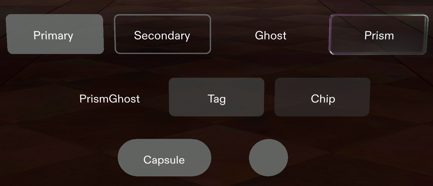
Button themes, shapes, and styles
UI Kit 4.0.0 has one theme, System 3.0. Theme is either Inherited (the default, follows the global theme) or System 3.0; both give the same look. The Shape and Style fields always appear in the Inspector.
| Theme | Value in code | Shapes | Styles |
|---|---|---|---|
| System 3.0 | System3 | Rectangle (default), Capsule, Round | Prism, PrismGhost, Primary (default), Secondary, Ghost, Tag, Chip |
The System 2.0 theme and its styles, such as PrimaryNeutral and Special, were removed in UI Kit 4.0.0. A button in an older project that names System 2.0 uses System 3.0 and logs a one-time warning. See the Release Notes.
On System 3.0, the Prism and PrismGhost styles draw the button as a beveled prism; the other styles draw a rounded rectangle. A Round button uses its width for both its width and its height.
Button Inspector properties
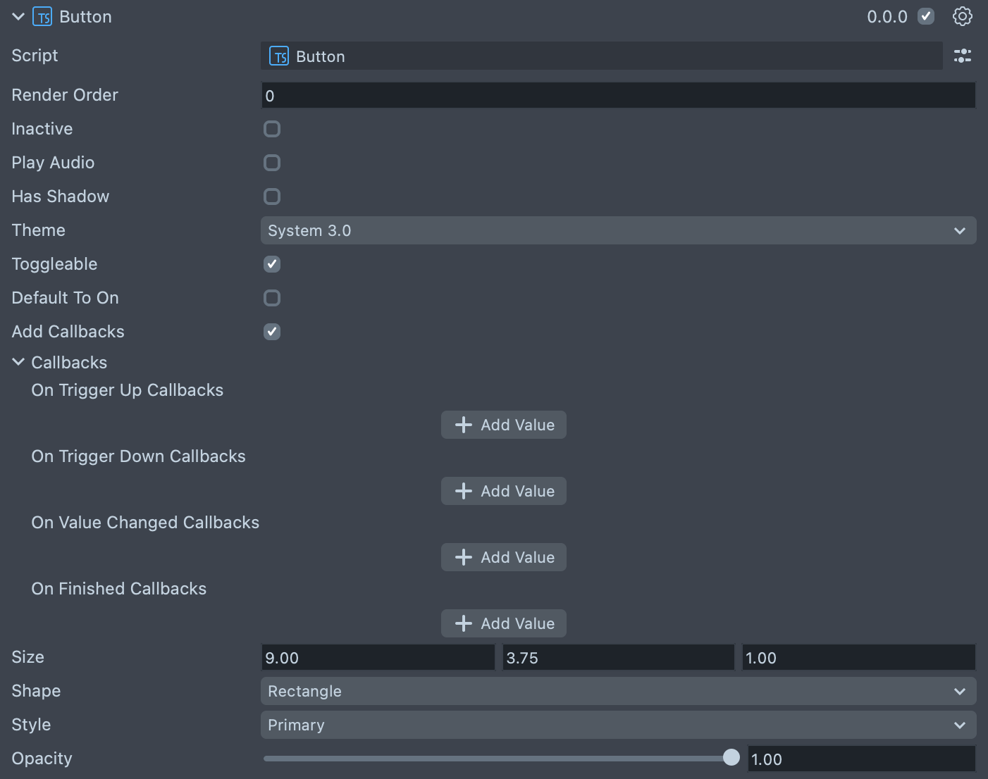
| Property | Description |
|---|---|
| Render Order | Sets the renderOrder of the visual components of the element. |
| Size | Sets the size of the element in centimeters. X is width, Y is height and Z is the depth of the underlying collider. The default is 9 × 3.75 × 1. |
| Inactive | Makes the element ignore input and shows its inactive look. Think "grayed out." |
| Play Audio | Turns on the built-in audio cues for the element. Off by default. |
| Has Shadow | Turns on the built-in shadow for this element. |
| Shadow Position Offset | (shows if Has Shadow is checked) The offset position for the shadow. The default is (0.05, −0.05, −0.01). |
| Theme | The theme the button uses: Inherited (the default, follows the global theme) or System 3.0. |
| Toggleable | Sets this element to have a toggle behavior. When triggered this element will stay on. |
| Default To On | (shows if Toggleable is checked) Sets the default state of the toggleable element to "on." |
| Add Callbacks | Adds the editor hooks for the event callbacks to the element. |
| On Trigger Up Callbacks | A callback for when the element finishes a trigger lifecycle. |
| On Trigger Down Callbacks | A callback for when the element starts a trigger lifecycle. |
| On Value Changed Callbacks | (shows if Toggleable is checked) A callback for when the element's value changes. |
| On Finished Callbacks | (shows if Toggleable is checked) A callback for when the element interaction and changes are all finished. |
| Shape | Rectangle, Capsule, or Round. |
| Style | The visual style, from the System 3.0 styles. See Button themes, shapes, and styles. |
| Opacity | The button's opacity, from 0 to 1. The default is 1. |
Create a Button from a script
To create a button in code, add the Button component, choose its theme, shape, and style with
setVariant(), set its size, then call initialize() and attach events. Call setVariant()
before initialize(): the button picks its visual when it initializes, so a variant set later has
no effect. setVariant() accepts the shape and style whether the theme is System3 or left at
Inherited; a shape or style that System 3.0 doesn't define logs a warning and falls back to the
default.
To make the button a toggle from code, call setIsToggleable(true) before initialize(), then
listen to onValueChange.
- TypeScript
- JavaScript
import { Button } from 'UIKit.lspkg/Scripts/Components/Button/Button';

/**
 * A simple programmatic button example
 */

@component
export class ExampleButtonScript extends BaseScriptComponent {
  onAwake() {
    // create new button
    const button = this.sceneObject.createComponent(
      Button.getTypeName()
    ) as Button;

    // choose theme, shape and style before initialize
    button.setVariant({ theme: 'System3', shape: 'Rectangle', style: 'Primary' });

    // update button settings
    button.size = new vec3(10, 4, 1);

    // call initialize to finish button internal setup
    button.initialize();

    // attach events
    button.onTriggerUp.add(() => {
      print('Button fully triggered!');
    });
  }
}
// Import required modules
const Button =
  require('UIKit.lspkg/Scripts/Components/Button/Button').Button;

/**
 * A simple programmatic button example
 */

function onAwake() {
  // create new button
  const button = script.sceneObject.createComponent(Button.getTypeName());

  // choose theme, shape and style before initialize
  button.setVariant({ theme: 'System3', shape: 'Rectangle', style: 'Primary' });

  // update button settings
  button.size = new vec3(10, 4, 1);

  // call initialize to finish button internal setup
  button.initialize();

  // attach events
  button.onTriggerUp.add(() => {
    print('Button fully triggered!');
  });
}

// Start the script
onAwake();
Related pages for the UI Kit Button
- Toggle Group: make a set of toggle buttons where only one is on.
- Custom Visual: replace a button's look with your own visual.
- Extend Component: subclass
Buttonto add content or behavior. - Architecture: how
Buttonbuilds onBaseButtonandVisualElement.