Extend Component
Extend a UI Kit 4.0.0 component in TypeScript: subclass Button to add inputs, create its visual, and build its own text and image content for SPECS Lenses.
- Snapchat: not supported
- SPECS: fully supported
- Camera Kit Web: not supported
- Camera Kit Mobile: not supported
- SnapchatNot supported
- SPECSFully supported
- Camera Kit WebNot supported
- Camera Kit MobileNot supported
You can extend a UI Kit component by creating a new component that extends the existing one. In
TypeScript, create a new component class, extend an existing UI Kit component, and add the
functionality you need. This page shows how with the UI Kit Button, for developers who need a
reusable component that UI Kit's settings alone don't give them.
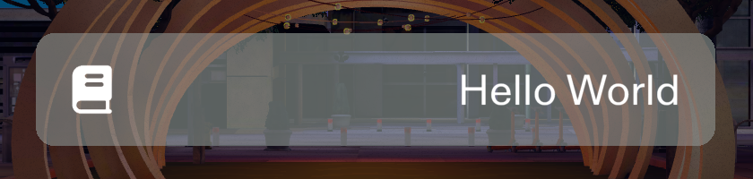
Extend the UI Kit Button with your own content
The CustomButton below extends Button and adds two Inspector inputs, Text and
Icon. It overrides createDefaultVisual(), the method a UI Kit visual element calls when it
initializes without a visual, to create a RoundedRectangleVisual with the button's current theme
style. Then, in onAwake(), it creates a Text object and an Image object inside the button.
Some details the example relies on:
- The style key passes the button's own
visualStyleType,effectiveStyle, and theme, so the visual draws the style chosen in the button's Theme and Style fields. Withtransparent: this.isAlwaysTransparent, outline styles such as Ghost and Secondary keep their transparent fill. - The image uses
IMAGE_MATERIAL_ASSET, the image material UI Kit exports fromUIKit.lspkg/Scripts/Utility/Assets. - A Button keeps a draw-order Canvas on its own scene object and draws the children you add above its body, so the text and image need no Canvas of their own.
- To change the corner radius of a Button after it initializes, set its
cornerRadiusproperty rather than the visual's: the button re-applies its own radius when its size changes.
For text and icons inside a widget, UI Kit 4.0.0 also provides addContentToElement (from
UIKit.lspkg/Scripts/Components/Content/ElementContentFactory), which builds themed content for
you; this example builds the content by hand to show how a subclass can own it.
- TypeScript
- JavaScript
import { Button } from 'UIKit.lspkg/Scripts/Components/Button/Button';
import { IMAGE_MATERIAL_ASSET } from 'UIKit.lspkg/Scripts/Utility/Assets';
import { RoundedRectangleVisual } from 'UIKit.lspkg/Scripts/Visuals/RoundedRectangle/RoundedRectangleVisual';

/**
 * CustomButton is a custom button component that allows you to create a button with an image and text.
 * It extends the Button component and uses a RoundedRectangleVisual for the visual.
 */

@component
export class CustomButton extends Button {
  @input
  text: string = 'Hello World';

  @input
  icon: Texture;

  /*
   * Can be overridden to create a custom visual for the button.
   * See the Custom Visual page for more information.
   */
  protected createDefaultVisual(): void {
    if (!this._visual) {
      const defaultVisual: RoundedRectangleVisual = new RoundedRectangleVisual({
        sceneObject: this.sceneObject,
        style: {
          visualElementType: this.visualStyleType,
          style: this.effectiveStyle,
          themeName:
            this.normalizedThemeOverride !== 'Inherited'
              ? this.normalizedThemeOverride
              : undefined,
        },
        transparent: this.isAlwaysTransparent,
      });

      defaultVisual.cornerRadius = 0.5;
      this._visual = defaultVisual;
    }
  }

  onAwake(): void {
    super.onAwake();
    this.createButtonContent();
  }

  createButtonContent(): void {
    // create text
    const textObject = global.scene.createSceneObject('Text');
    textObject.setParent(this.sceneObject);
    const text = textObject.createComponent('Text');
    text.text = this.text; // set input text
    text.size = 50;
    text.worldSpaceRect = Rect.create(
      -this.size.x * 0.5 + 1,
      this.size.x * 0.5 - 1,
      -this.size.y * 0.5,
      this.size.y * 0.5
    );
    text.horizontalAlignment = HorizontalAlignment.Right;
    // create image
    const imageObject = global.scene.createSceneObject('Image');
    imageObject.setParent(this.sceneObject);
    const image = imageObject.createComponent('Image');
    image.mainMaterial = IMAGE_MATERIAL_ASSET.clone(); // provide image material
    image.mainPass.baseTex = this.icon; // set icon texture
    const imageTransform = imageObject.getTransform();
    imageTransform.setLocalPosition(
      new vec3(this.size.x * -0.5 + this.size.y * 0.5, 0, 0.1)
    );
    imageTransform.setLocalScale(
      new vec3(this.size.y * 0.5, this.size.y * 0.5, 1)
    );
  }
}
// Import required modules
const Button =
  require('UIKit.lspkg/Scripts/Components/Button/Button').Button;
const IMAGE_MATERIAL_ASSET =
  require('UIKit.lspkg/Scripts/Utility/Assets').IMAGE_MATERIAL_ASSET;
const RoundedRectangleVisual =
  require('UIKit.lspkg/Scripts/Visuals/RoundedRectangle/RoundedRectangleVisual').RoundedRectangleVisual;

//@input string text = "Hello World" {"hint":"Button text"}
//@input Asset.Texture icon {"hint":"Button icon texture"}

/**
 * CustomButton is a custom button component that allows you to create a button with an image and text.
 * It extends the Button component and uses a RoundedRectangleVisual for the visual.
 */

// Define the CustomButton class that extends Button
var CustomButton = function () {
  Button.call(this);

  this._text = script.text || 'Hello World';
  this._icon = script.icon;
};

// Set up inheritance
CustomButton.prototype = Object.create(Button.prototype);
CustomButton.prototype.constructor = CustomButton;

// Override createDefaultVisual method
CustomButton.prototype.createDefaultVisual = function () {
  if (!this._visual) {
    const defaultVisual = new RoundedRectangleVisual({
      sceneObject: this.sceneObject,
      style: {
        visualElementType: this.visualStyleType,
        style: this.effectiveStyle,
        themeName:
          this.normalizedThemeOverride !== 'Inherited'
            ? this.normalizedThemeOverride
            : undefined,
      },
      transparent: this.isAlwaysTransparent,
    });

    defaultVisual.cornerRadius = 0.5;
    this._visual = defaultVisual;
  }
};

// Override onAwake method
CustomButton.prototype.onAwake = function () {
  Button.prototype.onAwake.call(this);
  this.createButtonContent();
};

CustomButton.prototype.createButtonContent = function () {
  // create text
  const textObject = global.scene.createSceneObject('Text');
  textObject.setParent(this.sceneObject);
  const text = textObject.createComponent('Text');
  text.text = this._text;
  text.size = 50;
  text.worldSpaceRect = Rect.create(
    -this.size.x * 0.5 + 1,
    this.size.x * 0.5 - 1,
    -this.size.y * 0.5,
    this.size.y * 0.5
  );
  text.horizontalAlignment = HorizontalAlignment.Right;
  // create image
  const imageObject = global.scene.createSceneObject('Image');
  imageObject.setParent(this.sceneObject);
  const image = imageObject.createComponent('Image');
  image.mainMaterial = IMAGE_MATERIAL_ASSET.clone();
  image.mainPass.baseTex = this._icon;
  const imageTransform = imageObject.getTransform();
  imageTransform.setLocalPosition(
    new vec3(this.size.x * -0.5 + this.size.y * 0.5, 0, 0.1)
  );
  imageTransform.setLocalScale(
    new vec3(this.size.y * 0.5, this.size.y * 0.5, 1)
  );
};

// Note: This script defines a custom button class.
// To use it, you would need to create an instance of CustomButton
// and attach it to a scene object programmatically.
Related pages for extending UI Kit components
- Custom Visual: style each interaction state of a visual.
- Architecture: the Element, Visual, and VisualElement classes you extend.
- Button: the component this example extends.