TextInputField
Reference for the UI Kit 4.0.0 TextInputField component: single-line text fields that open the SPECS keyboard, with input types, an action slot for voice input, and text events.
- Snapchat: not supported
- SPECS: fully supported
- Camera Kit Web: not supported
- Camera Kit Mobile: not supported
- SnapchatNot supported
- SPECSFully supported
- Camera Kit WebNot supported
- Camera Kit MobileNot supported
The UI Kit TextInputField component creates text input fields. It opens the keyboard of the
selected input type when the field gets focus and closes it when the field loses focus, updates
the displayed text, and manages text rendering for you, so don't open or close the keyboard
yourself. Use it for usernames, messages, search queries, and other single-line text.
TextInputField Inspector properties
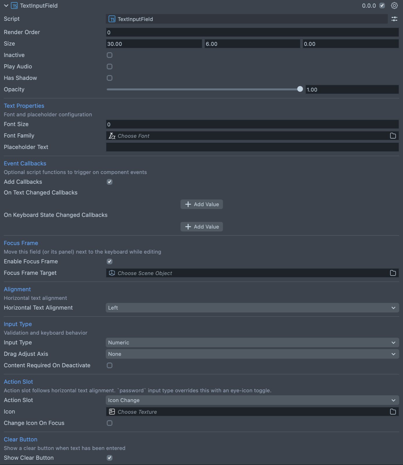
| Property | Description |
|---|---|
| Render Order | Sets the renderOrder of the visual components of the element. |
| Size | Sets the size of the element. X is width, Y is height and Z is the depth of the underlying collider. |
| Inactive | Makes the element ignore input and shows its inactive look. Think "grayed out." |
| Play Audio | Turns on the built-in audio cues for the element. |
| Has Shadow | Turns on the built-in shadow for this element. |
| Shadow Position Offset | (shows if Has Shadow is checked) The offset position for the shadow. |
| Opacity | An opacity multiplier for the background, the text, and the editing visuals. The default is 1. |
| Font Size | A custom font size. Left at 0 (the default), the font size scales from the field's height (Size Y). |
| Font Family | Sets a font asset. |
| Placeholder Text | Adds placeholder text which is displayed when the TextInputField is empty. |
| Add Callbacks | Adds the editor hooks for the event callbacks to the element. |
| On Text Changed Callbacks | (shows if Add Callbacks is checked) A callback for when text changes in the TextInputField. |
| On Keyboard State Changed Callbacks | (shows if Add Callbacks is checked) A callback for when the keyboard opens or closes. |
| Enable Focus Frame | While the field is being edited, moves it toward the system keyboard, then returns it when editing ends. On by default. Has an effect only when the platform's focus frame is active. |
| Focus Frame Target | (shows if Enable Focus Frame is checked) The object that moves toward the keyboard. Leave it empty to move the nearest parent Frame (the whole panel), or the field itself if it has no Frame above it. |
| Horizontal Text Alignment | The alignment of the text within the field: Left (the default) or Right. |
| Input Type | Sets the type of text that can be input into this field. The options are Default, Numeric, Password, Pin, URL, and Email. |
| Drag Adjust Axis | (shows if Input Type is Numeric) Lets people drag the field along this axis to step the number by its displayed precision (2.50 steps by 0.01): None (the default), Horizontal, or Vertical. Ignored while the keyboard or voice input is active. |
| Content Required On Deactivate | Puts the field in its error state when it loses focus while empty. |
| Action Slot | What the button inside the field does: None, Voice Input (the default), or Icon Change. The slot sits on the side set by Horizontal Text Alignment. With Input Type Password, the slot is an eye icon that shows or hides the text instead. |
| Icon | (shows if Action Slot is Icon Change) Sets the texture for the icon. |
| Change Icon On Focus | (shows if Action Slot is Icon Change) Turns on a behavior that swaps the icon when the TextInputField is selected. |
| Alternate Icon | (shows if Change Icon On Focus is checked) Sets the texture for the icon during focus. |
| Show Clear Button | Shows a clear button once text has been entered. On by default. |
In UI Kit 4.0.0, Action Slot replaces the Use Icon checkbox of earlier versions: to show an icon in the field, set Action Slot to Icon Change.
Create a TextInputField from a script
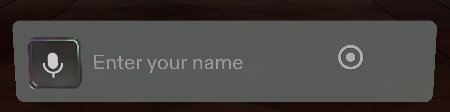
The script below creates a text input field and sets its placeholder text, input type, and size.
A TextInputField initializes itself; for work that needs its generated parts, such as setting
fontSize, use its onInitialized event.
Listen to onTextChanged for every change of the text and to onReturnKeyPressed for the
moment the user commits it; there is no onSubmit event. onKeyboardStateChanged reports the
keyboard opening and closing, and onEditMode the field entering and leaving editing.
- TypeScript
- JavaScript
import { TextInputField } from 'UIKit.lspkg/Scripts/Components/TextInputField/TextInputField';

/**
 * Example script for the TextInputField component.
 * It creates a text input field and sets its placeholder text and input type.
 */

@component
export class ExampleTextInputFieldScript extends BaseScriptComponent {
  onAwake() {
    const textInputField = this.sceneObject.createComponent(
      TextInputField.getTypeName()
    ) as TextInputField;
    textInputField.placeholderText = 'Enter your name';
    textInputField.inputType = 'default';
    textInputField.size = new vec3(15, 3, 1);
  }
}
// Import required modules
const TextInputField =
  require('UIKit.lspkg/Scripts/Components/TextInputField/TextInputField').TextInputField;

/**
 * Example script for the TextInputField component.
 * It creates a text input field and sets its placeholder text and input type.
 */

function onAwake() {
  const textInputField = script.sceneObject.createComponent(
    TextInputField.getTypeName()
  );
  textInputField.placeholderText = 'Enter your name';
  textInputField.inputType = 'default';
  textInputField.size = new vec3(15, 3, 1);
}

// Start the script
onAwake();