Tooltip
Reference for the UI Kit 4.0.0 Tooltip component: show contextual help text when people hover a UI Kit element in a SPECS Lens, with an optional tail and icon.
- Snapchat: not supported
- SPECS: fully supported
- Camera Kit Web: not supported
- Camera Kit Mobile: not supported
- SnapchatNot supported
- SPECSFully supported
- Camera Kit WebNot supported
- Camera Kit MobileNot supported
The UI Kit Tooltip component creates a pop-up tooltip when someone hovers over its parent. Create
a child object of a UI Kit element (a Button, a TextInputField, or another visual element), add the
Tooltip component to it, and use its transform to position it.
The parent finds the tooltip itself: when a UI Kit visual element initializes, it registers the
first Tooltip on its own object or its children, hides it, and shows it while the element is
hovered. A Tooltip under an object that isn't a UI Kit visual element doesn't pop up on its own.
To attach a tooltip from code, or replace the one an element found, call the element's
registerTooltip(tooltip); to change the text through the element, call setTooltip(text).
Tooltip Inspector properties
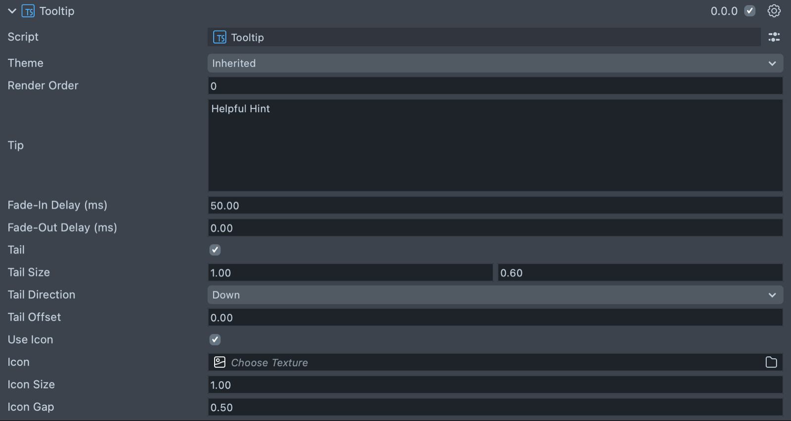
| Property | Description |
|---|---|
| Theme | The theme used to style the tooltip: Inherited (the default, follows the global theme) or System 3.0. |
| Render Order | Sets the renderOrder for the visuals of the element. The default is 1000. |
| Tip | Sets the text of the Tooltip. The default text reads Helpful Hint. |
| Fade-In Delay (ms) | Milliseconds to wait before the fade-in animation starts. The default is 50. |
| Fade-Out Delay (ms) | Milliseconds to wait before the fade-out animation starts. The default is 0. |
| Tail | Draws a triangular connector hanging off one edge of the tooltip's backing. Off by default. |
| Tail Size | (shows if Tail is checked) The base width and depth of the tail, in local-space centimeters. The default is 1 × 0.6. |
| Tail Direction | (shows if Tail is checked) Which edge the tail hangs off: Down (the default), Up, Left, or Right. |
| Tail Offset | (shows if Tail is checked) Shifts the tail along its edge, in centimeters. The default is 0. |
| Use Icon | Displays an icon alongside the tooltip text. Off by default. |
| Icon | (shows if Use Icon is checked) The texture to display as the icon. |
| Icon Size | (shows if Use Icon is checked) The width and height of the icon, in local-space centimeters. The default is 1. |
| Icon Gap | (shows if Use Icon is checked) The gap between the icon and the text, in local-space centimeters. The default is 0.5. |
Add a Tooltip to a UI Kit element from a script
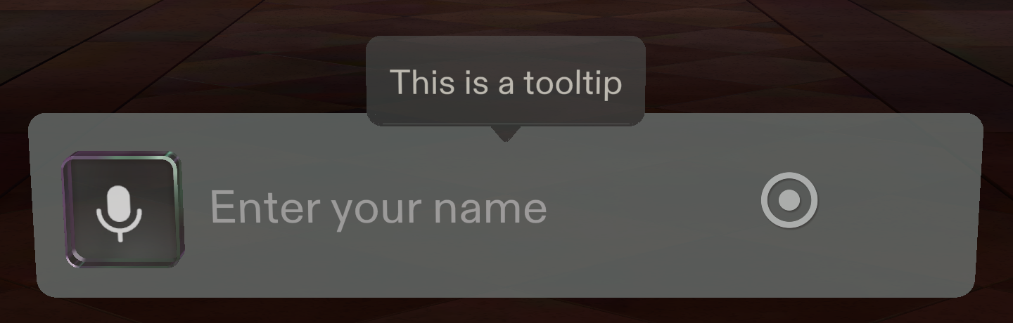
The script below creates a TextInputField, then a child object with a Tooltip, and sets the tooltip's text and position. The field registers the tooltip when it initializes.
- TypeScript
- JavaScript
import { TextInputField } from 'UIKit.lspkg/Scripts/Components/TextInputField/TextInputField';
import { Tooltip } from 'UIKit.lspkg/Scripts/Tooltip';

/**
 * Example script for the Tooltip component.
 * It creates a text input field and a tooltip and sets the tooltip's text and position.
 */

@component
export class ExampleTooltipScript extends BaseScriptComponent {
  onAwake() {
    const textInputField = this.sceneObject.createComponent(
      TextInputField.getTypeName()
    ) as TextInputField;
    textInputField.placeholderText = 'Enter your name';
    textInputField.inputType = 'default';
    textInputField.size = new vec3(15, 3, 1);

    const tooltipObject = global.scene.createSceneObject('Tooltip');
    tooltipObject.setParent(this.sceneObject);
    const tooltip = tooltipObject.createComponent(
      Tooltip.getTypeName()
    ) as Tooltip;
    tooltip.tip = 'This is a tooltip';
    tooltipObject.getTransform().setLocalPosition(new vec3(0, 4, 0));
  }
}
// Import required modules
const TextInputField =
  require('UIKit.lspkg/Scripts/Components/TextInputField/TextInputField').TextInputField;
const Tooltip = require('UIKit.lspkg/Scripts/Tooltip').Tooltip;

/**
 * Example script for the Tooltip component.
 * It creates a text input field and a tooltip and sets the tooltip's text and position.
 */

function onAwake() {
  const textInputField = script.sceneObject.createComponent(
    TextInputField.getTypeName()
  );
  textInputField.placeholderText = 'Enter your name';
  textInputField.inputType = 'default';
  textInputField.size = new vec3(15, 3, 1);

  const tooltipObject = global.scene.createSceneObject('Tooltip');
  tooltipObject.setParent(script.sceneObject);
  const tooltip = tooltipObject.createComponent(Tooltip.getTypeName());
  tooltip.tip = 'This is a tooltip';
  tooltipObject.getTransform().setLocalPosition(new vec3(0, 4, 0));
}

// Start the script
onAwake();
Related pages for the UI Kit Tooltip
- TextInputField: the field the example attaches its tooltip to.
- Button: another UI Kit element that shows a child Tooltip on hover.