Additive Display and Color
SPECS layers light onto the real world instead of replacing it. How that changes what users can see, and the hue, saturation, and brightness values that stay comfortable and distinct.
Additive display
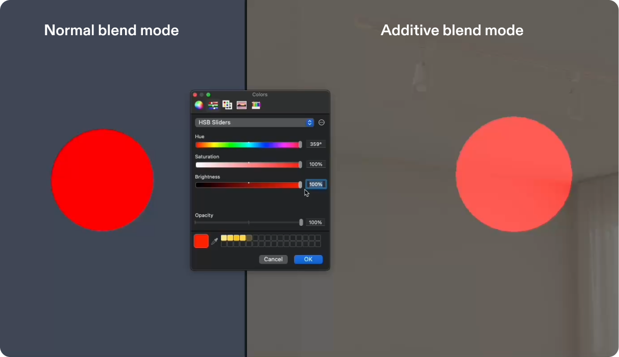
SPECS displays operate in an additive color space: virtual content is layered onto the real world rather than replacing it. Visibility is directly influenced by brightness and contrast against the environment.
- Darker colors appear less visible and may blend into the real-world background, though the object still exists in space. Black isn't rendered at all: the real world shows through.
- Brighter colors appear more visible and stand out against the environment.
Design so that important elements remain perceptible across varying lighting conditions.


Hue and saturation
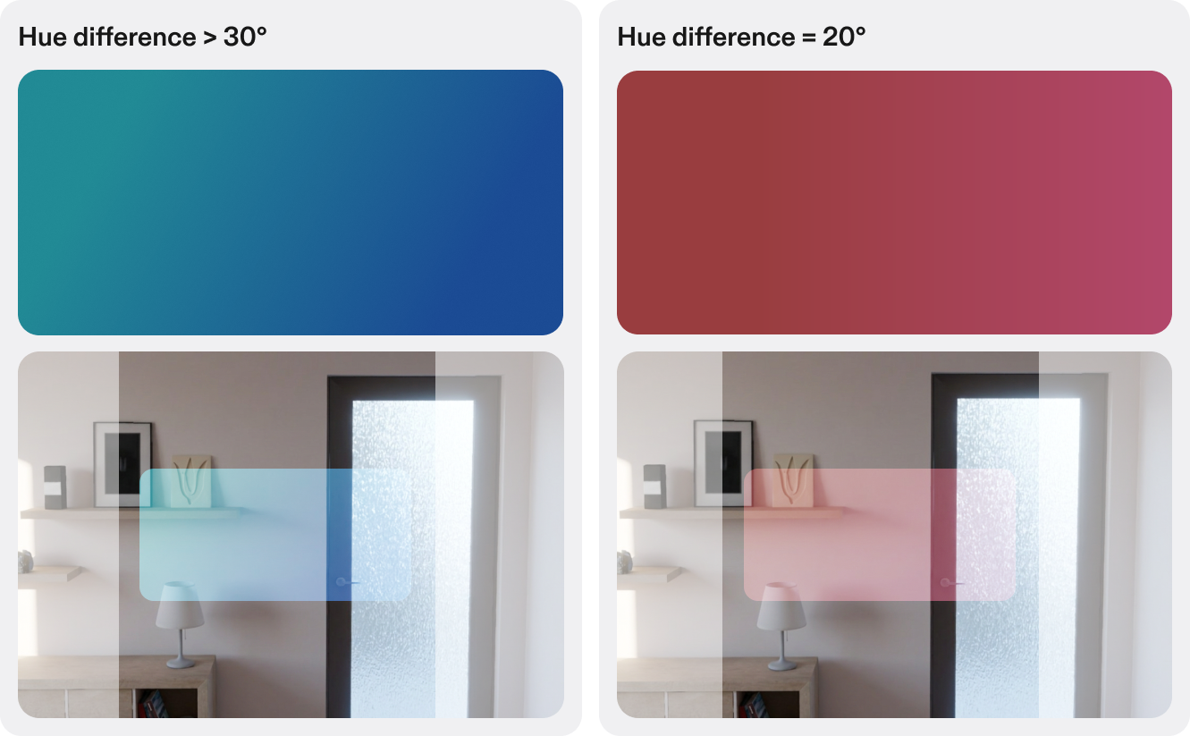
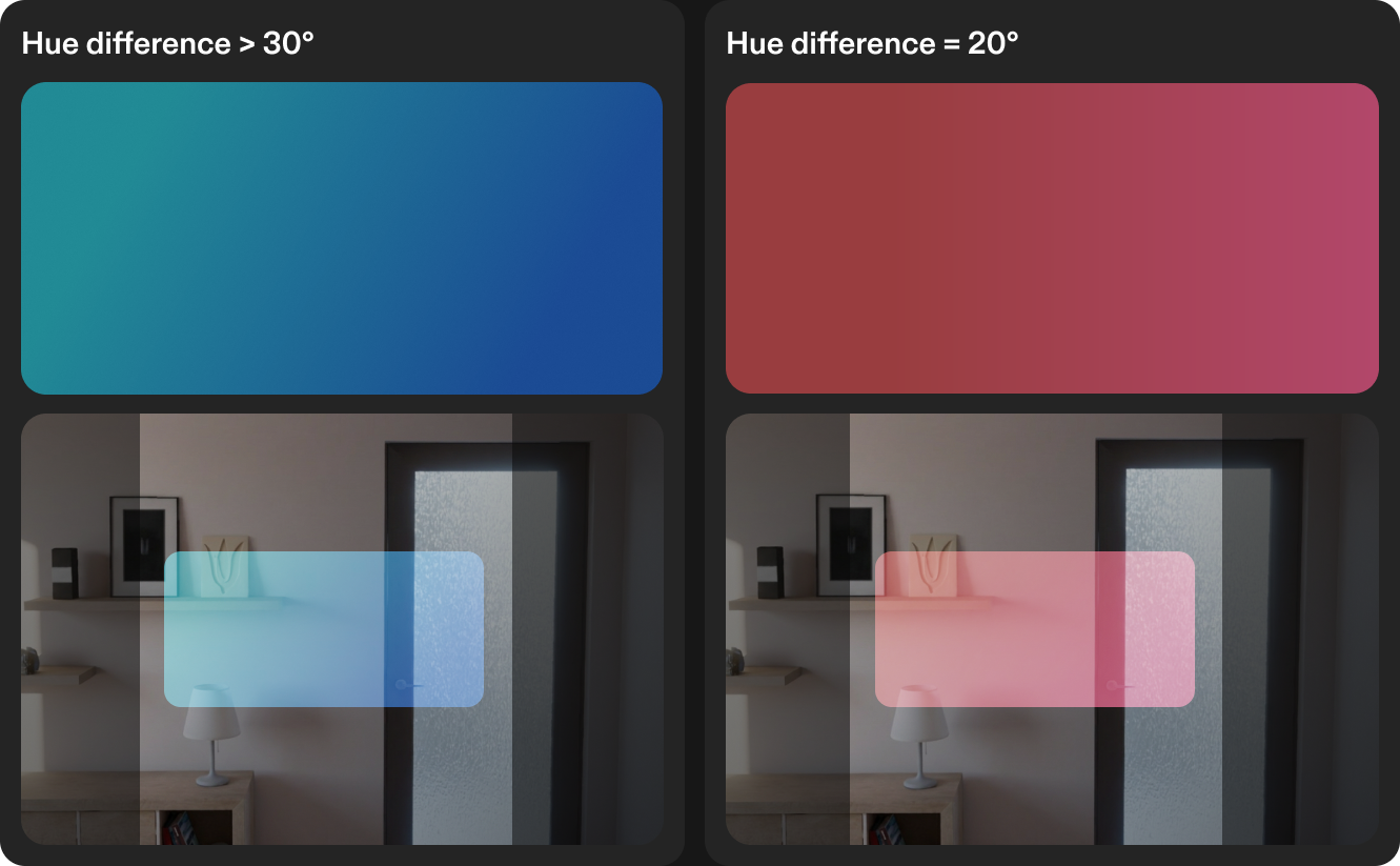
- Keep at least a 30° difference in hue between colors that need to be told apart. At 20°, neighbouring colors start to read as the same color.
- For the best eye comfort, use a saturation of 85–95%.
Black and white
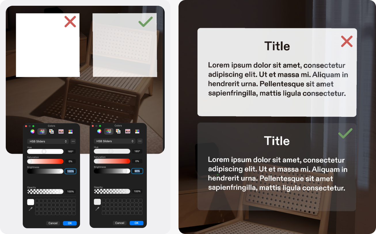
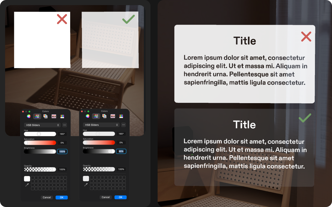
- Use white at a brightness of 80–90%. It is more visually comfortable, particularly when users focus on an object for a long time.
- White is the brightest thing in view, so large white areas tire the eyes and compete with the real world. Keep white to 5–10% of the field of view: text, icons, and the active control.
- Don't rely on black: it disappears. Use it only where you want the real world to show through.
Color perception
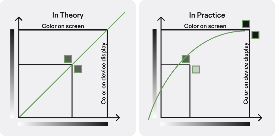
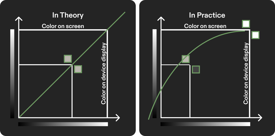
Work in sRGB in Figma as your screen and reference palette, but expect it not to be a 1:1 match to what you see on device. The SPECS display doesn't map cleanly onto a standard color space, and the final result depends on device calibration and display sequence.
- No exact conversion formula exists yet.
- Color can change with the display sequence. If the sequence changes, device-tuned values may need recalibrating.
- Color varies from device to device, and sometimes between the left and right eye, so what looks right on one unit may not fully match another.
- Dark colors often look darker on device, and bright colors brighter.
Always check your colors on device before you finalize them.