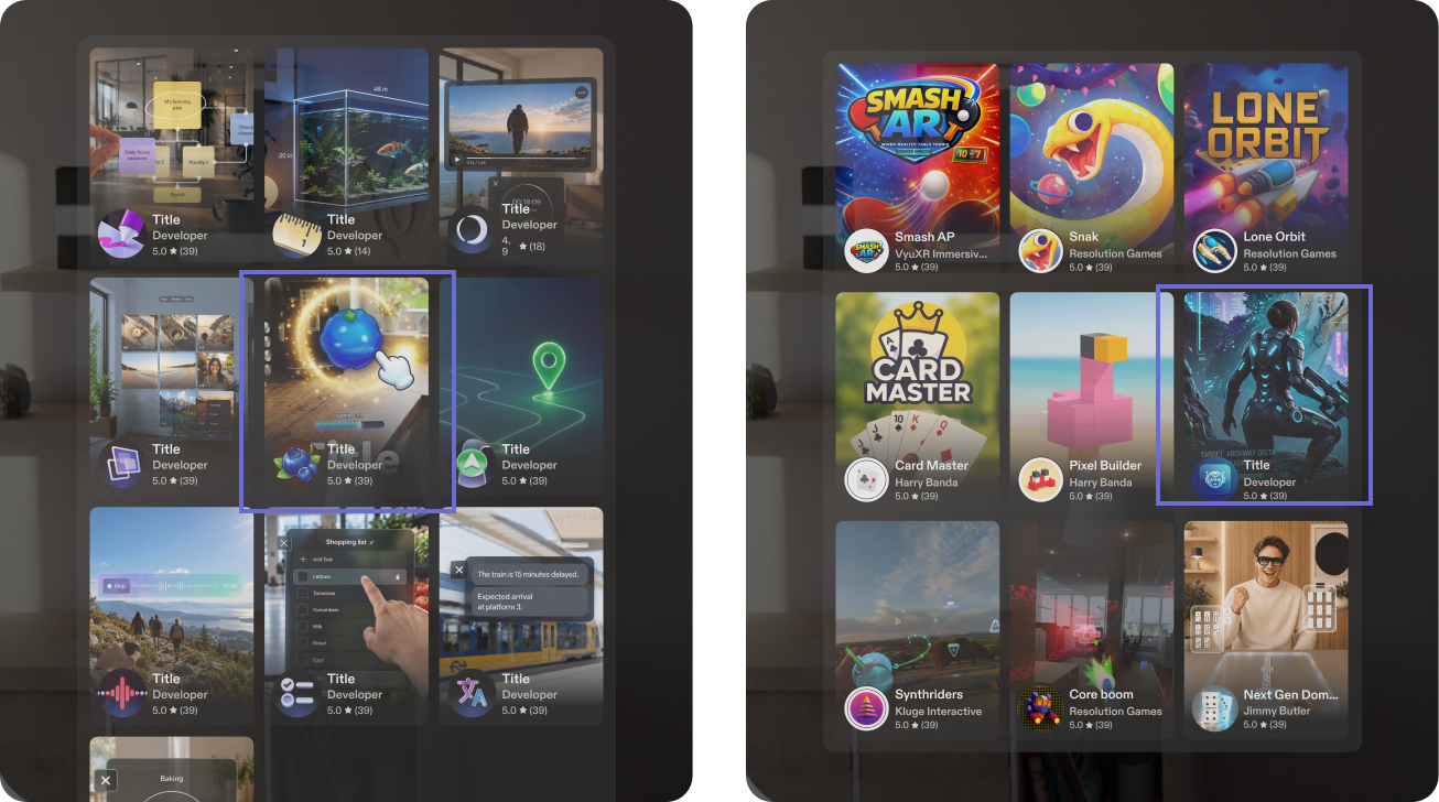
Tile and Icon Best Practices
Design a SPECS Lens icon that reads at a glance and a tile thumbnail that shows what the Lens does.
Icon vs thumbnail
The icon identifies the Lens; the thumbnail promotes it.
Icon design
- Minimal and instantly recognizable
- A clear silhouette and a strong focal point
- Legible at small sizes
- One primary subject, symbol, or idea
- Strong contrast, with no unnecessary detail
- No text or complex compositions
- Represents the identity of the Lens
Thumbnail design
- More expressive, engaging, and promotional
- Communicates what the experience does
- Shows a use case, an action, or a key feature
- Can include people, environments, and richer detail
- A strong composition with a clear focal point
- Makes users want to explore or try the experience
- Not a raw product screenshot
- Feels like promotional artwork, not an enlarged icon
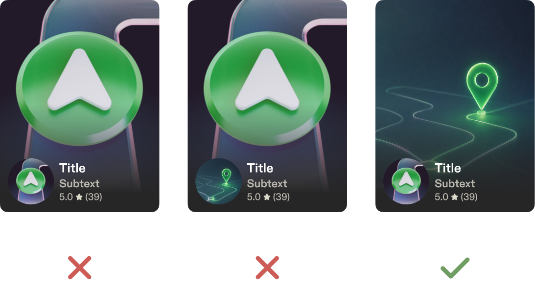
AI-generated images
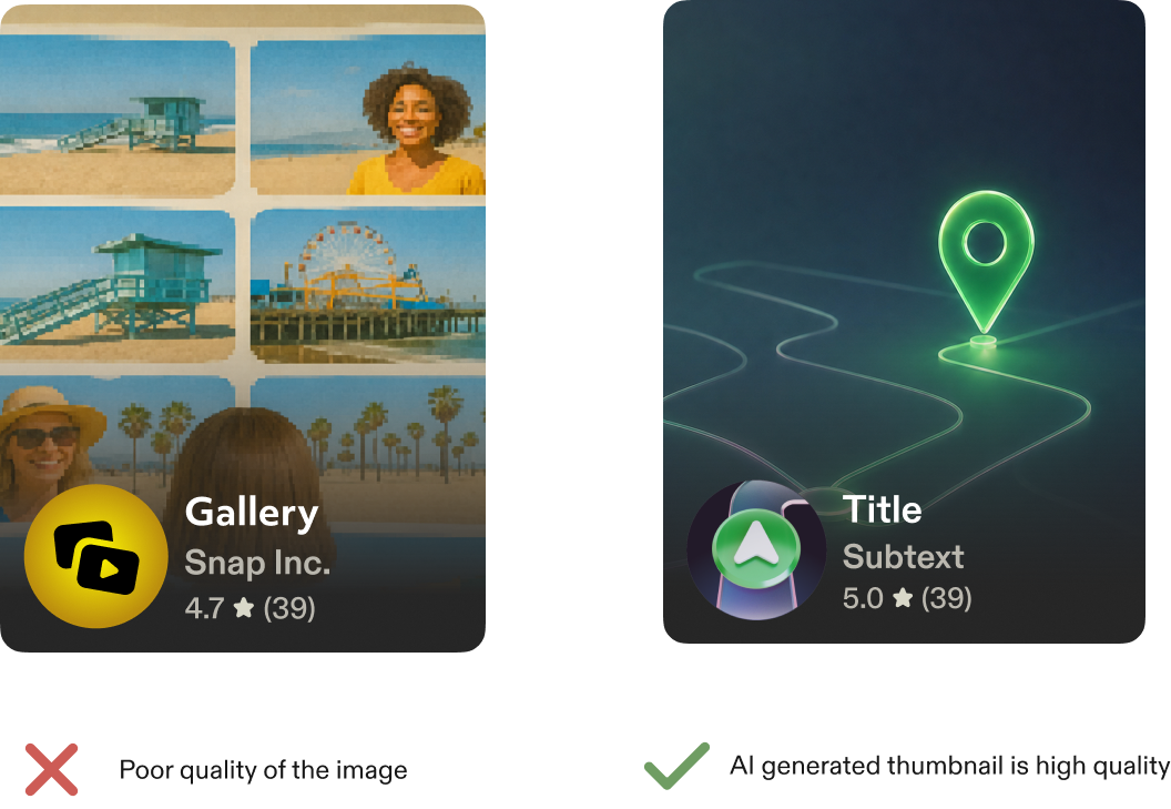
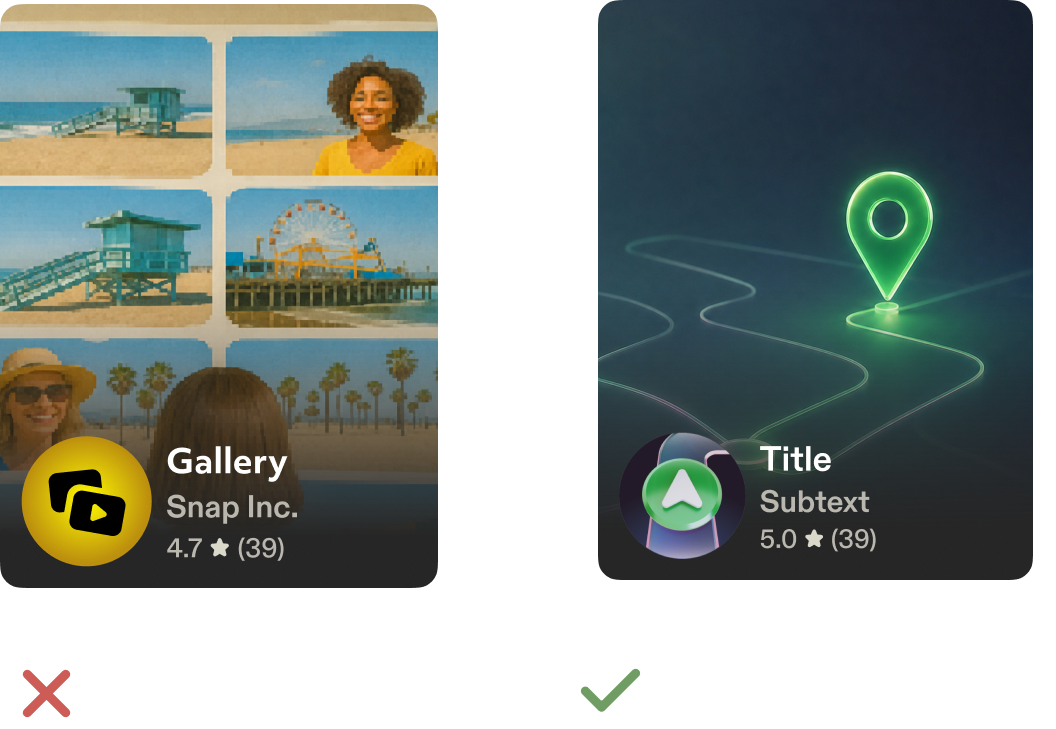
You can use AI to create tiles and icons, but both images must be high quality, with no AI artifacts.
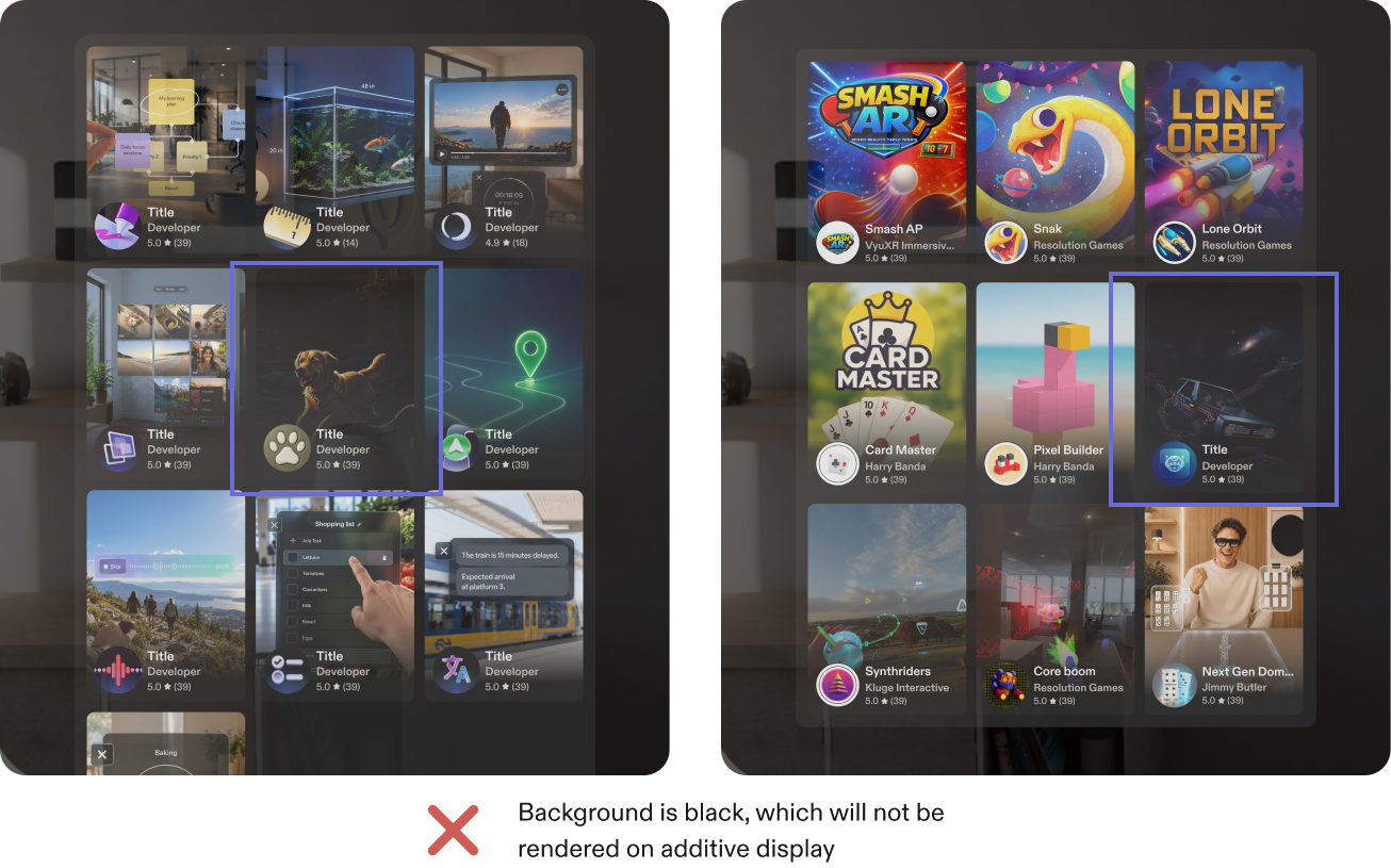
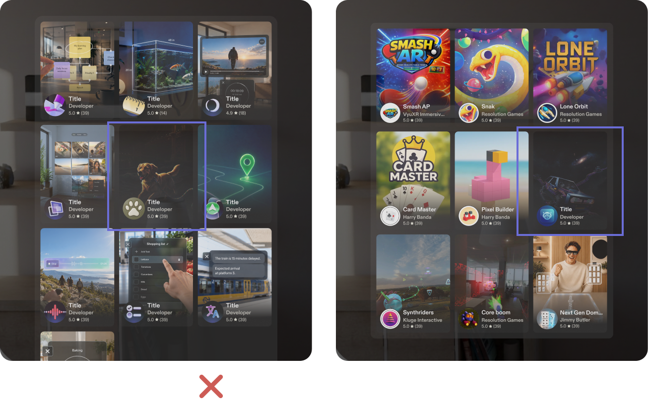
Avoid pure black and white
Don't use pure black or pure white in the tile thumbnail or icon. A black background isn't rendered on the additive display. See Additive Display and Color.
Show what the Lens is about
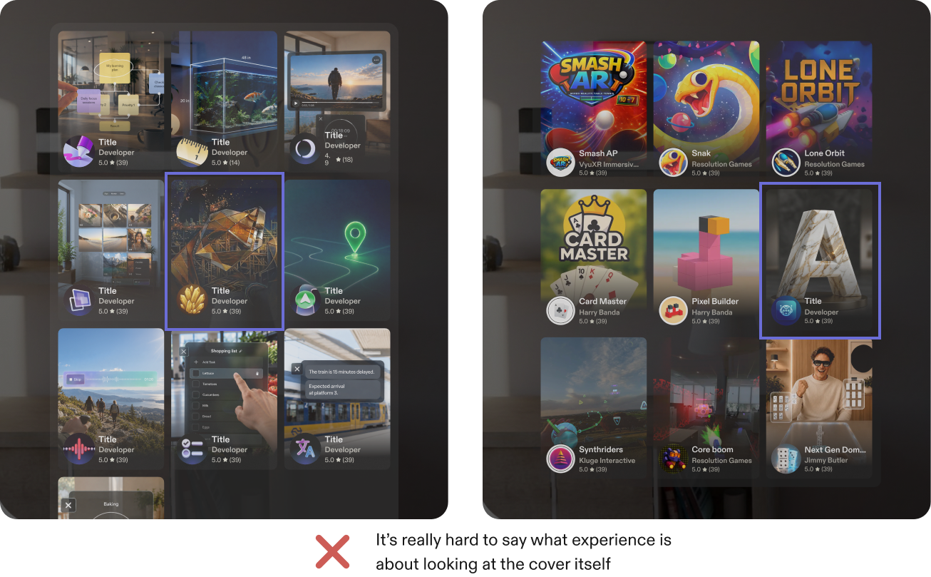
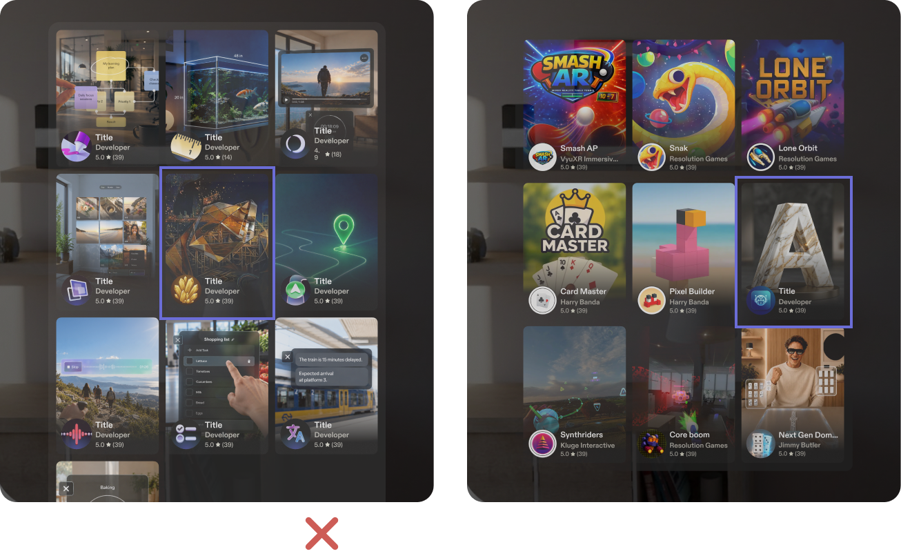
Make sure the tile thumbnail represents the experience. If users can't tell what the Lens is about from the cover, they're less likely to open it.
Keep text clear of the tile labels
If the thumbnail contains text, make sure it doesn't overlap the Lens name and author on the tile.