Navigation
Moving through SPECS UI: top and side navigation, forward and backward between layers, breadcrumbs for deeper hierarchies, and scrolling within a layer.
Top and side navigation
- Center navigation within the frame.
- Make navigation 80% of the height of its container frame. If you need more space, use scroll.
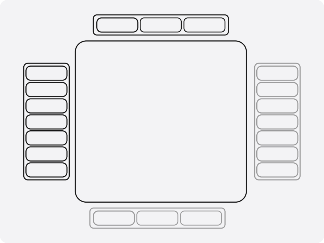
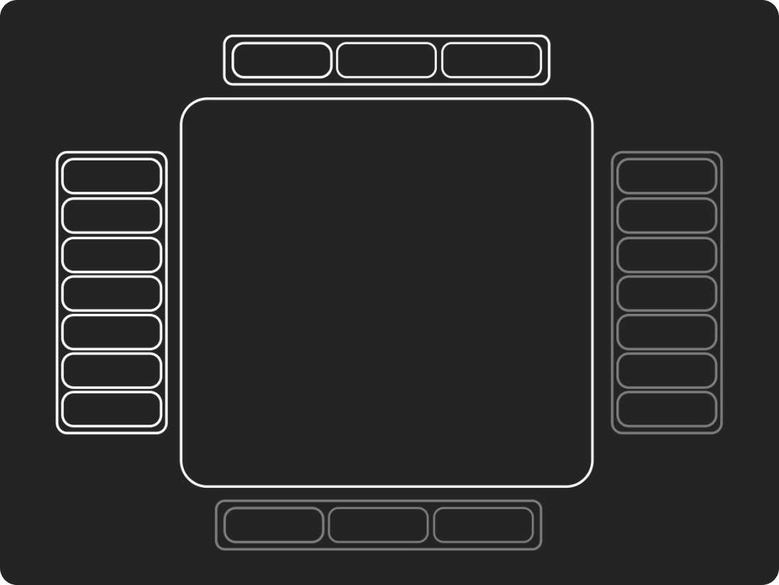
Forward and backward
Forward and backward are directional motions: moving deeper into content (forward) or returning to a previous layer (backward).
- Outgoing content slides out along the X axis and fades; incoming content slides in from the opposite side.
- The frame, toolbar, and close button stay fixed. Only the content travels.
- Forward moves left and backward moves right, so the direction alone tells users where they are going.
Hierarchy and breadcrumbs
When navigation goes more than one level deep, show breadcrumbs above the frame so users always know where they are and can jump back.
- Breadcrumbs appear at the first forward step, with one chip per level.
- They slide along the navigation axis as levels are added or removed, the same lateral motion as the content.
- Tapping a chip pops back to that level, and the content slides backward.
Keep it shallow. Breadcrumbs are a safety net, not a structure: if a flow needs more than three levels, rethink the hierarchy.
Scroll
Peer-level content that doesn't fit the frame scrolls vertically. Scrolling moves the user through more of the same layer; forward and backward move between layers.
- Items fade as they cross the edge of the frame instead of being clipped hard.
- Prefer scrolling over shrinking content to fit.
- Keep primary actions in the fixed toolbar, not inside the scrolling area.
To build a scrolling area, use UI Kit's Scroll Window.